Skip to content
About this portfolio
About
About meRolesExperienceCertificationsEducationContact
Works
CDXO
CDXOEasyTranslateScout
Discovery
HRPS 2.0
GatherSG
GatherSG Design SystemHDB Contact CentreThree GatherSG productsCase ConnectGALE
Open Works folder
Practice
practice.md01The loop02Gates03Evidence04Design system05Handoff06AI practice07Rhythm08People
Contact
Email mail@limkelv.inDownload résumé (.md)Open in kelvin.md
About meRolesExperienceCertificationsEducationContact
CDXO
CDXOEasyTranslateScout
Discovery
HRPS 2.0
GatherSG
GatherSG Design SystemHDB Contact CentreThree GatherSG productsCase ConnectGALE
Open Works folder
practice.md01The loop02Gates03Evidence04Design system05Handoff06AI practice07Rhythm08People
Email mail@limkelv.inDownload résumé (.md)Open in kelvin.md

Favourites

  • kelvin.md
  • Works
  • Practice

CDXO

  • CDXO
  • EasyTranslate
  • Scout

Discovery

  • HRPS 2.0

GatherSG

  • GatherSG Design System
  • HDB Contact Centre
  • Three GatherSG products
  • Case Connect
  • GALE

  • CDXO3 items
  • Discovery1 item
  • GatherSG5 items
Works
NameKindYearsRole
CDXOFolder––
DiscoveryFolder––
GatherSGFolder––
  • 01-cdxo.md2026
  • 02-easytranslate.md2026
  • 03-scout.md2026
CDXO
NameKindYearsRole
01-cdxo.mdCase study2026–
02-easytranslate.mdCase study2026Senior UX Designer
03-scout.mdCase study2026–
  • 04-hrps.md2026
Discovery
NameKindYearsRole
04-hrps.mdCase study2026–
  • 05-design-system.md2020 to 2026
  • 06-hdb-contact-centre.md2023 to 2025
  • 07-gathersg-products.md2021 to 2025
  • 08-case-connect.md2020 to 2021
  • 09-gale.md2019 to 2021
GatherSG
NameKindYearsRole
05-design-system.mdCase study2020 to 2026UX Designer (I), then UX Designer (II), then Senior UX Designer
06-hdb-contact-centre.mdCase study2023 to 2025UX Designer (II), then Senior UX Designer from April 2024
07-gathersg-products.mdCase study2021 to 2025UX Designer (II), then Senior UX Designer from April 2024
08-case-connect.mdCase study2020 to 2021UX Designer (I), then UX Designer (II) from January 2021
09-gale.mdCase study2019 to 2021UX Designer (I), then UX Designer (II) from January 2021

Info

      Hi, I’m Kelvin.

      I'm an artist, a visual designer, a product designer, a user experience (UX) designer, a creative, documenting my life visually, a collector of interesting things, a noticer of small details, someone who lives to eat, a tech gadgety new gear kinda guy, a museum kinda guy, a coffee enthusiast and a cat person, and I'm based in Singapore.I’m

      Kelvin Lim, Singapore

      About

      I'm a Senior UX Designer at GovTech, with 18 years in design. I lead multidisciplinary projects that run across several government agencies.

      I trained as a graphic designer and graduated with First Class Honours in Design Communication from LASALLE College of the Arts. For the ten years before GovTech, I freelanced across product and interface design, brand identity and editorial print.

      At GovTech I set up DesignOps and design systems, and led design for a platform team as it grew to 14 designers. Today I mentor designers across the agency and on public-good initiatives. I also sit on the organisation's hiring panel, where I help keep standards high for the designers we hire.

      Outside work I document my life in pictures. I have a soft spot for well-designed objects, and I look for museums wherever I travel. I love good food and good coffee, and I like getting my hands on new gadgets and technology early.

      Email me at mail@limkelv.in.

      Works folderNine case studiesFrom a translation tool built into government websites to a design system a whole platform still runs on. practice.mdHow I run the workResearch gates, evidence rules, design system operations, and AI with a person checking it.

      Roles

      1. Apr 2024 to now

        Senior UX Designer

        GovTech

        Lead roles

        • Lead designer, CDXO projectsJul 2026 to nowScout, CDXO, EasyTranslate
        • Lead designer, HRPS 2.0 Phase 1Sep 2025 to Jul 2026
        • UX Lead, GatherSGApr 2024 to Sep 2025
      2. Jan 2021 to Mar 2024

        UX Designer (II)

        GovTech

        Lead roles

        • UX Lead, GatherSGMay 2023 to Mar 2024
      3. Jan 2018 to Dec 2020

        UX Designer (I)

        GovTech

        Lead roles

        • Lead UI designer, WOGAA
      4. 2015 to 2017

        Graphic Designer

        Kong Studio & Pico Art International

      5. 2008 to 2018

        Freelance designer

        KLVN

      The full history follows in Experience, or download my résumé as Markdown.

      Experience

      1. Jan 2018 to present

        GovTech

        Senior UX Designer

        Projects since 2024

        • CDXO
        • EasyTranslate
        • Scout
        • HRPS 2.0
        • GatherSG Design System
        • HDB Contact Centre

        Other notable projects in GovTech

        • Case Connect
        • Government Assisted Living Ecosystem (GALE)
        • Wireless Alert Alarm System (WAAS)
        • GoWhere (COVID)
        • Whole-of-Government Application Analytics (WOGAA)

        Accolades

        • One Public Service Award 2024 (Case Connect and WOG Appeal System)
        • IT Leader Awards 2021: Infrastructure
        • Best Use of Emerging Technologies at Inspire Tech Awards 2021 (GALE)
        • 2021 Global ICT Excellence Awards (GALE)
        • Red Dot Design Award 2020, in collaboration with NUS DID
      2. Oct 2015 to Dec 2017

        Kong Studio & Pico Art International

        Graphic Designer

        I ran the full creative process for BCA Gallery, a two-storey exhibition space for the Building and Construction Authority. The work covered branding, a custom typeface, wayfinding, infographics and a 3D art installation. I also illustrated its six zones and a Sensory Garden, and oversaw every stage, from concept to production.

      3. 2015 to 2017

        Wizer Studios

        Product and Visual Designer (freelance)

        I led branding and identity, and designed the Digital Fashion Week mobile app.

      4. 2008 to 2018

        KLVN

        Product and Visual Designer

        I did ten years of freelance branding and digital work, for clients including The Blue Lotus, Hong Kong Tennis Open, The Shirt Bar, Huw Roman and The Cocoa Pods.

      Certifications

      1. May 2026

        UXLx: User Experience Lisbon

        Lisbon, Portugal

        Certificate of Participation

        A three-day conference, 13 to 15 May 2026, with 21 hours of training.

        Workshops

        • Knowledge Management with AI for Research Ops (Emily DiLeo)
        • From Systems Thinking to Systems Doing (Sylvie Abookire)
        • Impactful Service Design (Ayesha Moarif)
        • Designing AI Experiences for Human Agency (Brandon Harwood)
      2. 2021

        Nielsen Norman Group (NN/g)

        UX Master Certification

        With specialty recognition in Interaction Design, UX Management and UX Research.

        Certification ID 1031026, type UXMC.

      3. 2019

        Copenhagen Institute of Interaction Design (CIID)

        Design Thinking for Services

        Certificate of Completion.

      Education

      1. 2013 to 2015

        LASALLE College of the Arts

        Singapore; Goldsmiths, University of London

        Bachelor of Arts (Honours) in Design Communication

        First Class Honours

      2. 2009 to 2011

        Temasek Polytechnic

        Singapore

        Diploma in Interactive Media Informatics
      Contact

      Hiring a senior or lead designer, or working on something that crosses organisations? I'd like to hear about it.

      mail@limkelv.in
      Kelvin Lim, SingaporeUpdated 31 October 2026

      CDXO

      This case study is password protected

      This case study isn’t public yet. Email mail@limkelv.in for the password.

      EasyTranslate

      EasyTranslate

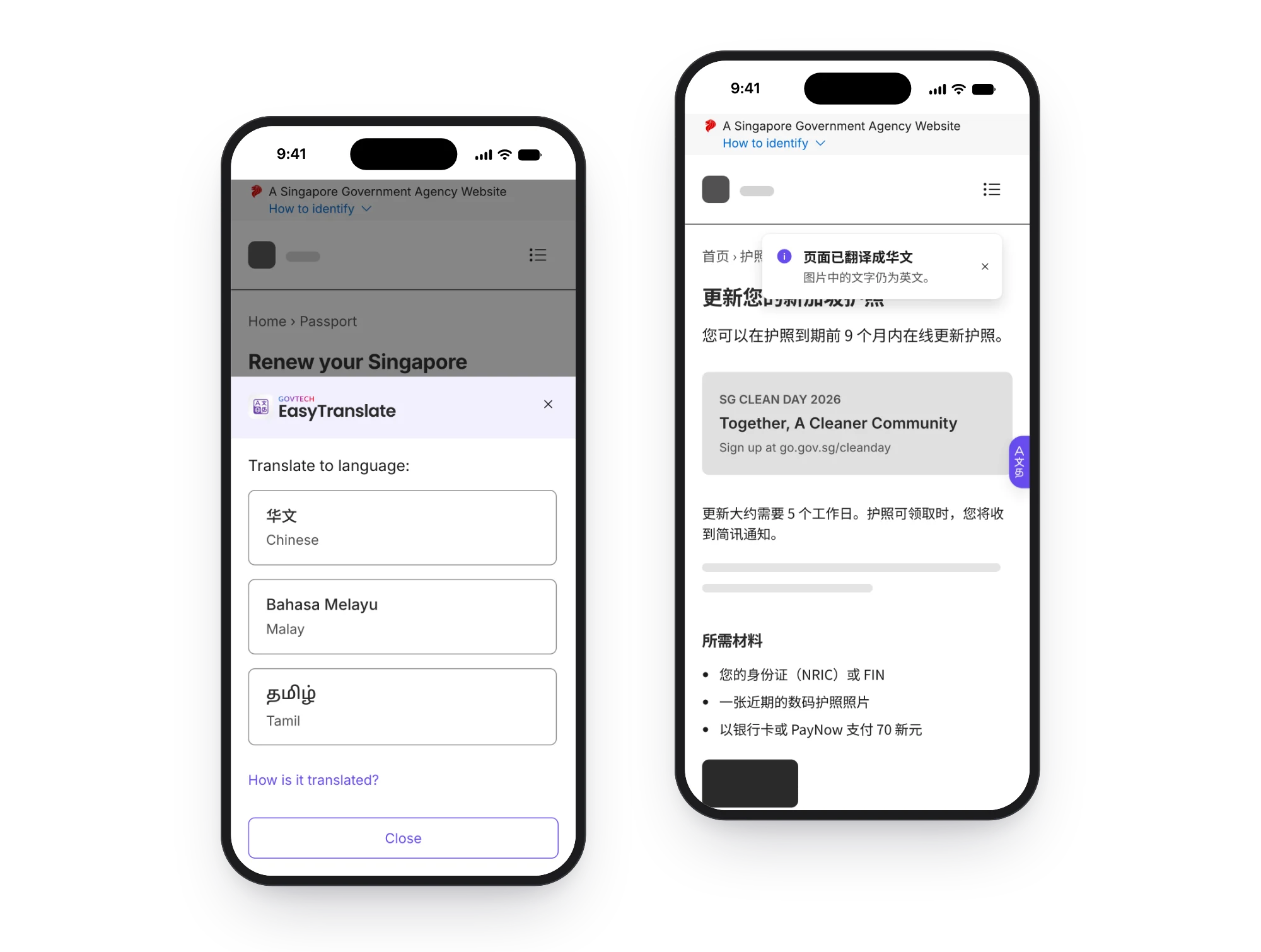
      EasyTranslate translates government web pages into Chinese, Malay and Tamil. It comes through a service every government site already carries, so whatever we change, good or bad, reaches every site that uses it at the same time.

      EasyTranslate V2 on two phones: the language drawer, under the GovTech EasyTranslate logo, offering Chinese, Malay and Tamil over an English passport page, and the same page in Chinese with a done message and the widget tucked against the edge.
      01

      One release, every site at once

      EasyTranslate doesn't have a site of its own. It runs on everyone else's, so it has to work within their rules.

      EasyTranslate uses a large language model to translate Singapore government pages into Chinese, Malay and Tamil. It comes through WOGAA, the analytics service every government site already carries, so one change reaches every site with the widget on the same day.

      Fig. 01One release reaches every site. Each page starts with the first version's small EN tab, with its card open. Point at a phone and the new button appears there first. These are sample pages, not live sites.

      The first version went live in July 2026 as a whole-of-government trial.

      The policy lineIf a machine translation is wrong, it's the citizen who accepts that risk, not the agency. They accept it on the consent screen.

      Legal cleared the consent wording, so any shorter version has to go back to them. The consent step also hides the wait. The translation starts loading when someone picks a language, but it only appears once they accept.

      Working on pages it was never designed for

      Each agency also sets a Content Security Policy, a browser rule for where styling may load from. Some block styling written inside the page, and others block styling loaded from outside. So whichever way the engineers ship the widget's look, it breaks on some sites. That gave us two rules. The widget must still work on those sites, even if it looks plainer. And no visual change counts as done until someone has checked it on the busiest sites.

      02

      Taking over a product people were already using

      I took over the interface in August 2026, ten days after launch.

      I was the design owner, so I made the design calls, and bigger issues went to the wider team. The redesign had been logged but not started, so I owned it from the plan onwards. I also owned accessibility, interaction decisions and release fixes, and I shaped what the research asked, in what order and of whom.

      Around that, I worked closely with the engineers who built it, the researchers who ran the studies and product marketing, who ran the surveys. The usage figures on this page are the product's.

      03

      What I saw on a phone in the first week

      Before suggesting anything, I read the existing design files and used the live widget on a phone.

      The first problems I raised were basic: buttons too small to tap, text too small to read. For people who struggle with English, those basics have to work before anything else.

      In August 2026 I drafted a redesign plan led by accessibility. It covered a widget with two states, a decision on the 文A icon, and stages for auditing and rolling out. Apart from consent, two things couldn't change:

      • Reporting a bad translation, sentence by sentence, is a core feature. Agencies use the same form to send their own corrections.
      • Some pages must never be translated, so translation has to stop and restart as people move between pages. That moment needed designing too.

      Anything I changed had to work on pages I'd never see, for readers I couldn't test with yet.

      04

      Five changes for one thumb

      I designed for phones first. Each change answers something I saw in the first week, or a constraint that couldn't move.

      Two EasyTranslate V2 states on a phone: the resting widget, a 48-pixel purple button on the right of an English passport page, and the language drawer under the GovTech EasyTranslate logo, with Chinese, Malay and Tamil, a How is it translated? link and a Close button.
      48 px trigger, in reach of one thumb
      Language drawer, within thumb reach
      Fig. 02The widget resting, then choosing a language, in V2. V2 is the version after the redesign, and it's built but not live yet. Taken from its reference build, on a mock page.
      1. A bigger button that gets out of the way

        It's now 48px, with 16px text. A bigger button covers more of the page, so it slides aside as you scroll. Five seconds after a page loads, it tucks to an edge until someone uses it. In V2, on a first visit, it opens as a pill reading Translate this page. On phones it then stays tucked for the rest of the visit.

      2. A menu you can use with one hand

        Languages moved into a drawer that rises from the bottom of the screen. Each is labelled in its own script first, with English underneath. V2 adds a shortcut: hold the button, or point at it with a mouse, and the three languages fan out beside it. A tap still opens the drawer, which holds everything the shortcut does.

      3. An icon picked on evidence

        I supplied the options, from a globe to a plain A文. I also had the questions reordered, so a translation didn't give the answer away. One icon won among 105 people, but 97% of them read English comfortably. A survey in Chinese, Malay and Tamil is under way.

      4. Keeping consent, even though it costs a tap

        Consent is where the citizen accepts the risk, and legal clears its wording, so the redesign kept it.

      5. A way back from anywhere

        A translated page offers Restore Original, and an English link back for anyone who picked the wrong language. The done message warns that text in images stays in English.

      Fig. 03The drawer is built around one thumb. Move up the phone and it rises to meet you. Drawn from V2's drawer.
      Two phone screens from EasyTranslate V2: a page translated into Chinese with one tapped sentence highlighted in light purple and a 举报翻译 (Report Translation) button floating above it, and the feedback form that button opens, pre-filled with the original text, the language and the translation.
      Tap the sentence that's wrong
      Original, language and translation already filled in
      Fig. 04Reporting a translation in V2: tap a sentence, then the report button above it, and the form opens already filled in.

      Reporting a translation, one sentence at a time

      Citizens and agencies both use the form, so I treated it as core. In round one only four of seven people managed to send feedback, mostly because they couldn't find the option. Engineering asked how reporting would work with a keyboard and on a phone, and I answered in the design: a hidden report button on each sentence for keyboard users, and a short tip that explains the report mode. V2 drops the mode altogether. Tap or point at a sentence and it turns light purple, with a report button just above it.

      Try it: pick a language, then report a sentence. The demo runs V2, so holding the purple button, or pointing at it with a mouse, opens the shortcut menu. It skips the consent and how-to-report steps.

      1. 01Open EasyTranslate and pick a language
      2. 02Read the page in it
      3. 03Report a sentence
      A Singapore Government Agency WebsiteHow to identify
      Renew your Singapore passport
      You can renew your passport online up to 9 months before it expires.
      Renewal takes about 5 working days.
      You will receive an SMS when your passport is ready for collection.
      What you need
      • Your NRIC or FIN
      • A recent digital passport photo
      • Payment of S$70 by card or PayNow
      A Singapore Government Agency WebsiteHow to identify
      更新您的新加坡护照
      您可以在护照到期前 9 个月内在线更新护照。
      更新大约需要 5 个工作日。
      护照可领取时,您将收到简讯通知。
      所需材料
      • 您的身份证(NRIC)或 FIN
      • 一张近期的数码护照照片
      • 以银行卡或 PayNow 支付 70 新元
      A Singapore Government Agency WebsiteHow to identify
      A Singapore Government Agency WebsiteHow to identify
      Perbaharui pasport Singapura anda
      Anda boleh memperbaharui pasport anda dalam talian sehingga 9 bulan sebelum tamat tempoh.
      Pembaharuan mengambil masa kira-kira 5 hari bekerja.
      Anda akan menerima SMS apabila pasport anda sedia untuk diambil.
      Apa yang anda perlukan
      • NRIC atau FIN anda
      • Gambar pasport digital terkini
      • Bayaran S$70 melalui kad atau PayNow
      A Singapore Government Agency WebsiteHow to identify
      A Singapore Government Agency WebsiteHow to identify
      உங்கள் சிங்கப்பூர் கடவுச்சீட்டைப் புதுப்பிக்கவும்
      உங்கள் கடவுச்சீட்டு காலாவதியாவதற்கு 9 மாதங்களுக்கு முன்பே அதை இணையத்தில் புதுப்பிக்கலாம்.
      புதுப்பிக்க சுமார் 5 வேலை நாட்கள் ஆகும்.
      உங்கள் கடவுச்சீட்டு பெறத் தயாரானதும் உங்களுக்கு SMS அனுப்பப்படும்.
      உங்களுக்குத் தேவையானவை
      • உங்கள் NRIC அல்லது FIN
      • சமீபத்திய டிஜிட்டல் கடவுச்சீட்டுப் புகைப்படம்
      • அட்டை அல்லது PayNow மூலம் S$70 கட்டணம்
      A Singapore Government Agency WebsiteHow to identify

      Translate to language:

      正在翻译…
      页面已翻译成华文图片中的文字仍为英文。

      页面已翻译成华文

      图片中的文字仍为英文。

      如果您发现翻译有误,请点击下方的“举报翻译”按钮。

      我们非常感谢您的反馈,这将极大地帮助我们改进此工具!

      Menterjemah…
      Halaman diterjemah ke Bahasa MelayuTeks dalam imej kekal dalam Bahasa Inggeris.

      Halaman diterjemah ke Bahasa Melayu

      Teks dalam imej kekal dalam Bahasa Inggeris.

      Jika anda mendapati terjemahan yang salah, klik pada butang "Laporkan Terjemahan" di bawah.

      Maklum balas anda amat dihargai dan akan sangat membantu kami dalam menambah baik alat ini!

      மொழிபெயர்க்கிறது…
      பக்கம் தமிழில் மொழிபெயர்க்கப்பட்டதுபடங்களில் உள்ள உரை ஆங்கிலத்தில் உள்ளது.

      பக்கம் தமிழ் மொழிக்கு மொழிபெயர்க்கப்பட்டது

      படங்களில் உள்ள உரை ஆங்கிலத்திலேயே இருக்கும்.

      தவறான மொழிபெயர்ப்பை நீங்கள் கண்டால், கீழே உள்ள "மொழிபெயர்ப்பு குறித்துத் தெரிவிக்கவும்" பொத்தானைச் சொடுக்கவும்.

      உங்களின் கருத்து பெரிதும் பாராட்டப்படுகிறது. மேலும் இக்கருவி மேம்பட இது எங்களுக்குப் பெரிதும் உதவும்!

      A Singapore Government Agency Website. Beware of government impersonation scams. How to identify ▾
      Send feedback for translation
      Instructions
      Please describe the issue with the translation, and suggest a better translation, if possible.
      ⓘ Some fields below have been pre-filled.
      Translation
      1. Original text
      Renewal takes about 5 working days. You will receive an SMS when your passport is ready for collection.
      2. Translation language
      Simplified Chinese
      3. Translated text
      更新大约需要 5 个工作日。护照可领取时,您将收到简讯通知。
      Your Feedback
      4. Describe the issue with the translation
      9:41
      9:41

      Tap the purple button on the right of the page.

      Agencies use this form for corrections too, because it captures the exact pair of English and translated text that the database stores.

      05

      Testing with the people who need it most

      Researchers ran the studies. I made sure they asked fair questions of the right people.

      I built the Figma prototype for round one, an unmoderated study, and asked for language choices that didn't assume English.

      Round 1Seven people: six under 55 and one over 65. All seven listed English as a language they prefer to read.

      Everyone found the button and the way back, but reporting was the weak spot. Young English readers can't speak for the people EasyTranslate is for, though. So for round two I pushed for one-to-one sessions with senior volunteers at a partner's centres. Each session is about 30 minutes, and volunteers are screened against clear criteria. Nine are planned for October and November 2026, with seniors fluent in Chinese, Malay or Tamil.

      Meanwhile the first version was live and worked much the same way, so I suggested collecting feedback from live sites.

      06

      What came back when the release went out

      An update reaches every site at once, so fixes couldn't wait for the next round.

      1. Aug 2026

        I take over and flag buttons and text as too small on phones.

      2. Aug 2026

        I draft a redesign plan led by accessibility.

      3. Sep 2026

        Test prototype ready for round one.

      4. Oct 2026

        Redesign goes live.

      5. Oct 2026

        v1.0.1 ships the release-day fixes.

      6. Oct 2026

        v1.0.2 ships more interface fixes.

      7. Nov 2026

        V2 is built, with a fan-out shortcut and reporting by highlight. It isn't live.

      QA on release day found a label problem and button text set at 20px instead of 16px. I specified the fixes that day and they shipped in v1.0.1. Checking live sites showed how the host page affects the widget. Two sites' security rules blocked its link icon, and another site's base font size changed its type.

      Accessibility, still being checked

      My late-August WCAG 2.2 AA audit of the live widget found five failures, such as a report button hidden from screen readers on phones. My reference build of the redesign passed the same checks in my tests. Engineering confirmed the audit's findings. A disability-sector partner has since raised further accessibility concerns, which are still open.

      07

      Reach is easy to count, but we haven't shown yet that it helps

      The redesign is weeks old, so these numbers mostly predate it.

      How we defined success. We didn't set measures before release. The widget comes with a service every site has to carry, so counting sites only shows how far it reaches, not whether the design works. What would show that is people who need a translation finding the button, choosing a language, trusting the result and reporting errors.

      ~1,000people a day in September 2026, before the redesign
      105answered the icon survey, 97% comfortable in English
      4 of 7translated a page and sent feedback in round one

      UX layer

      Ease of use
      In round one, people struggled with reporting. Sessions with seniors are next.
      Icon recognition
      One icon won, but most of the people who voted read English.
      Accessibility
      Engineering confirmed the audit findings. The partner's concerns are still open.

      Operational layer

      Volume
      About 950 to 1,100 people a day in late September 2026, from the product's figures.
      Conversion
      In the two months to September, the share of panel opens that ended in a language pick rose from the high 50s to about 65%. In the first week after release, more people translated, but the pick rate fell as the launch bump faded. It's too early to call.

      In the news

      Minister Josephine Teo mentioned EasyTranslate in her address opening Inclusive Design Week in October 2026. Senior Minister of State Jasmin Lau was in the audience. CNA reported more than 125,000 translations across about 20 government websites since July.

      • CNA, TV reportDigital accessibility: New widget EasyTranslate helps translate government websitesOctober 2026
      • Ministry of Digital Development and InformationWelcome address by Minister Josephine Teo at GovTech's Inclusive Design WeekOctober 2026
      08

      What I'd do differently

      There are three hard things I'd do earlier.

      I'd agree how we measure success before launch. The team had suggested tracking how often people restore the original page, since that's a sign something failed. That belonged in a short plan owned by design, with task completion, pick rate and a date to check each one. Without that plan, a mixed first week is hard to read.

      I'd recruit seniors and mother-tongue readers from the start. Round one and the icon survey both leaned on confident English readers.

      And I'd put consent in the plan from the first draft. My draft left out the one step that legal had to clear and the redesign had to keep.

      I've left out agency names, colleagues and the consent wording. The screens and the demo come from V2's reference build, which isn't live yet. They sit on a mock page with the agency's name greyed out.

      Next project05 / GatherSG / Design systemsGatherSG Design System

      How one design system went from Case Connect to GatherSG, and then into the government's shared design system.

      Scout

      This case study is password protected

      This case study isn’t public yet. Email mail@limkelv.in for the password.

      HRPS 2.0

      This case study is password protected

      This case study isn’t public yet. Email mail@limkelv.in for the password.

      GatherSG Design System

      In 2020 I set up a design library for a three-person project. It went on to become a whole platform's design language. In 2026 I'm helping bring the best of it into the government's shared system.

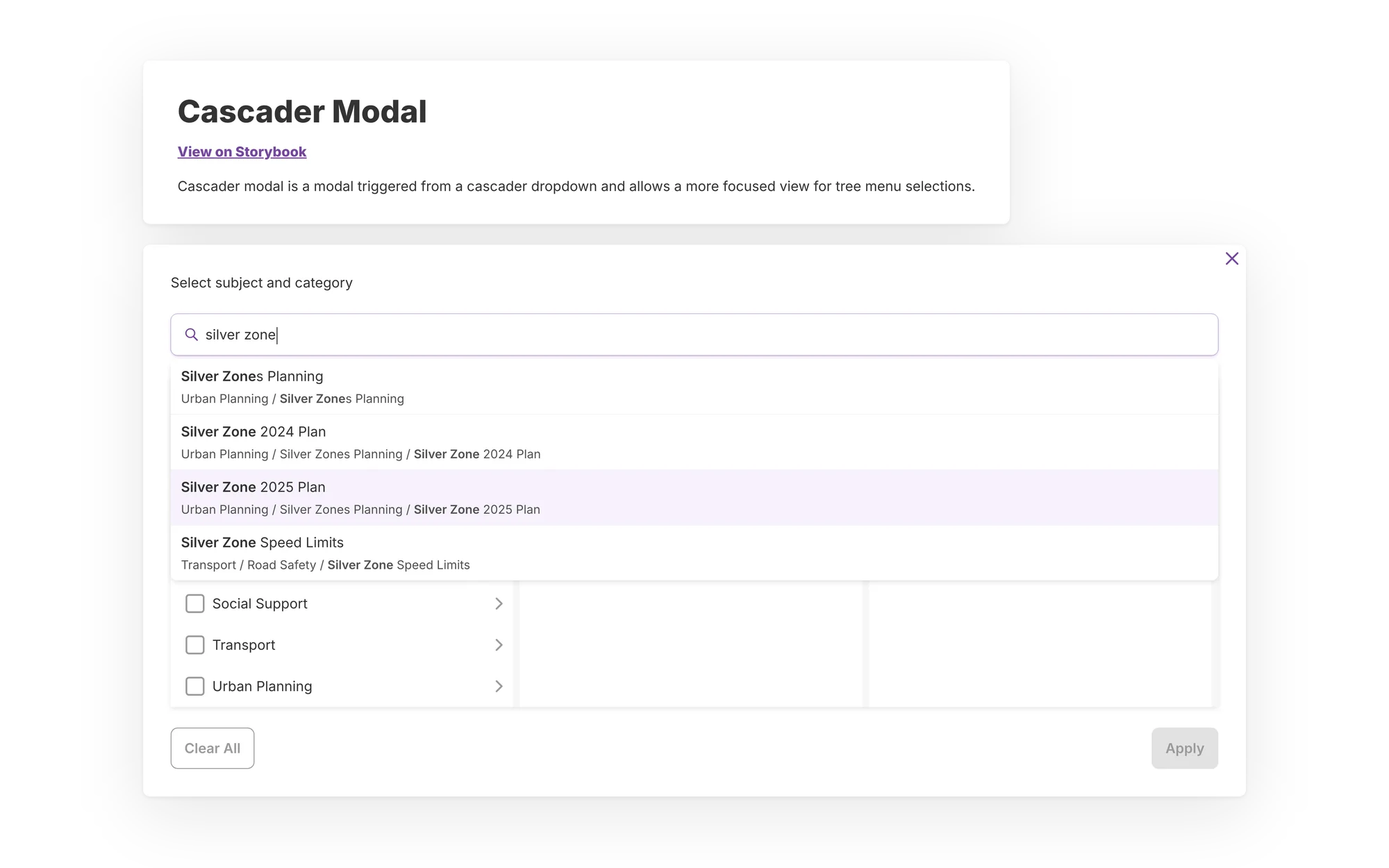
      The Cascader Modal from GatherSG DS 1.0 under its doc title, mid-search:
      01

      Three people, complex work and no system to start from

      In 2020 three people had to ship a case platform for several agencies. By 2026 the gap was a different one, in the government's shared system.

      In August 2020, soon after Circuit Breaker (Singapore's COVID-19 lockdown), MSF asked GovTech to build Case Connect. It would be one platform where social workers and partner agencies share a case. The core team was a UX Lead, a product manager and me.

      Casework screens are dense, and without shared components we'd have designed every case list and referral from scratch. Case Connect became GatherSG's first product. ComLink, Gather Queue, Service Connect, HDB Contact Centre and others followed, each for a different agency. They were all meant to feel like one family.

      SGDSThe Singapore Government Design System. Version 3 covers work tools as well as information sites.

      By 2026 the gap was somewhere else. The government runs several design systems, and what one calls a badge another calls a chip. If you count them the same way, GatherSG's and SGDS's catalogues are close in size. But SGDS has fewer of the parts work tools need: avatars, chips, search, popovers, button groups and data-table pieces. Those are what GatherSG does well.

      54GatherSG components, counted the way SGDS counts
      47SGDS components, September 2026
      02

      Four stages on the same system

      My scope grew over six years, and so did what I can take credit for.

      2020 to 2021: UX Designer (I), then (II), on Case Connect

      I was the most junior of three and did the screen work: the system, the screens and the prototypes. The UX Lead and product manager led the project.

      Before May 2023: design lead in practice on GatherSG

      As GatherSG grew, I was doing the lead's work before I had the title. I set up the team's DesignOps, meaning how it runs day to day, and the rules for changing the system.

      May 2023 to September 2025: UX Lead

      I led design on GALE and GatherSG until I moved off both in September 2025.

      2026: Senior UX Designer, on the SGDS side

      Who leadsThe SGDS team leads the roadmap and the code. I bring components, specs and audits to it.

      I now work with the SGDS team, rebuilding GatherSG's work-tool components on SGDS. I make the specs, the Figma components and the docs that AI coding tools read. SGDS engineers write the code.

      03

      Case Connect: the system came before the screens

      Building components first felt slow for three people with a deadline. We did it anyway.

      Discovery ran from August to late September 2020. The first thing I built after it was the design system, for two reasons.

      The practical reason was that three people had no time to redesign a status label on every screen. The bigger reason came from discovery. A case has one record but many parties, and each agency acts on its own part. That pattern kept coming back, in queues, appeals and community-link work.

      Every screen after that was faster to design. We tested the main journeys over two rounds with social workers and agency partners. Case Connect went live in July 2021.

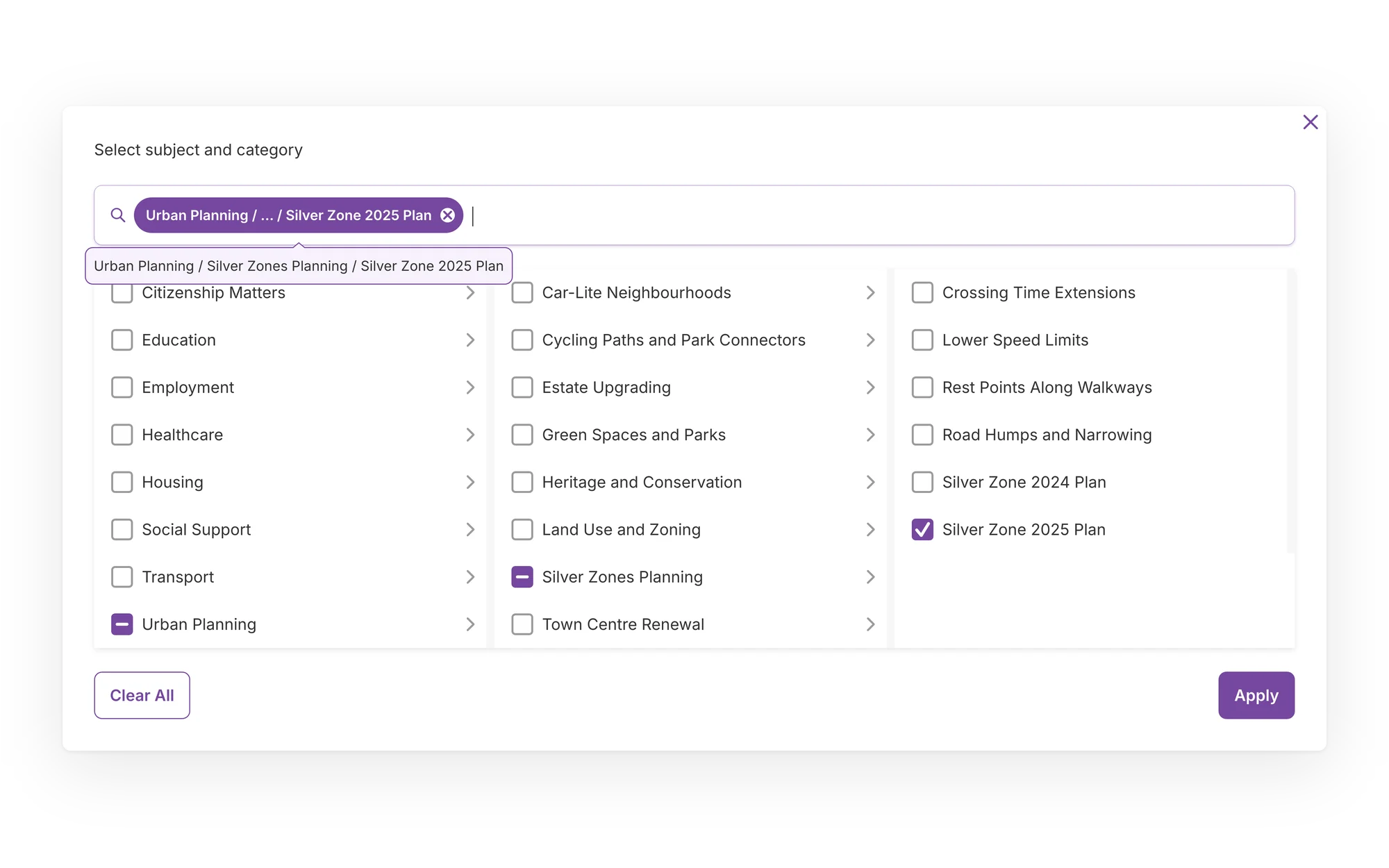
      The Cascader Modal from GatherSG DS 1.0 with one topic picked across three columns: Urban Planning, Silver Zones Planning and Silver Zone 2025 Plan. The parents show a part-selected mark, and the path sits in the search field as a purple chip, with the full path in a tooltip.
      Fig. 01The Cascader Modal in GatherSG DS 1.0, picking a topic three levels deep, with its full path on hover. The system was built for dense casework components like this one.
      04

      GatherSG: one language across a family of products

      Designers were on four or five products at once, each with its own agency and deadline. Keeping them consistent took shared habits as much as shared components.

      Governance01/04
      1. Ways of working
      2. Weekly huddles across products
      3. Champions and handover rules
      4. Grow it through the hardest product
      1. Ways of working

        I set up the team's DesignOps: design sessions, tidy files, rules for changing components, and handover to engineering. The test was whether a new designer on any product could start straight away.

      2. Weekly huddles across products

        The whole design team met weekly, so standards stayed the same across products. When I passed on a product after discovery, the next designer got a brief, a direction and a system they knew.

      3. Champions and handover rules

        As UX Lead I managed the design system champions and product designers, and mentored them on documenting and reusing components. I also set out mobile-first principles and wrote Figma handover rules.

      4. Grow it through the hardest product

        HDB Contact Centre needed patterns GatherSG lacked, like call-reason pickers, analytics tables and an email drawer with templates. I stopped it from splitting off into its own copy, so the patterns went back into GatherSG for later products to use.

      The screen that's hardest to design on one product ends up as a component the next product gets for free.

      The team grew to 14 designers while I was UX Lead. I led the hiring and onboarding, and set the team's rules.

      05

      SGDS: taking the useful parts, leaving the old problems

      In 2026 I switched sides, and started helping the shared system cover the kind of work GatherSG was built for.

      What 1.0 didn't have

      GatherSG DS 1.0 has colour and text styles but no Figma variables, the token layer that lets a system change its look in one place. It wasn't built to WCAG, the international accessibility guidelines. It wasn't built for AI tools either. Those were fair gaps for 2020, but they're the reason not to copy it across.

      Choosing SGDS over my own system

      In July 2026 my work widened into GovTech's accessibility and usability products. We compared SGDS, Flagship (another government system) and GatherSG on accessibility, maturity, tokens and AI readiness, using AI-built prototypes. We picked SGDS v3, not the system I knew best.

      The brief

      In September 2026 the brief asked for enough components to cover most government services, and themes so a social-sector service and a sport one could each look like itself.

      Every service would build on one shared base and still have room to look like itself.

      The SGDS lead and I agreed that SGDS provides the basics, like buttons and inputs, and agencies keep product-specific components on top. He estimated that 75 to 80% of a system could move in. He proposed auditing one system at a time, with the first audit as a template.

      The audit

      My audit counts both catalogues the same way, 54 GatherSG components against SGDS's 47, and gives each GatherSG component a decision.

      2828keep
      66improve
      88build
      1212skip

      That's 42 of 54 moving in, or 78%, which is inside his estimate. It also means 14 components of new work, and eight of them answer open SGDS issues. The audit also flags accessibility failures to fix on the way in, like table text at 2.78 to 1 contrast. The SGDS lead took it as a useful base for a joint roadmap.

      Density first

      Density, meaning how much fits on a screen, is where GatherSG has the strongest evidence. SGDS v3's defaults are roomier than casework needs. So I've proposed a tighter operational mode for its type and spacing, mapped onto SGDS role tokens. Everything else waits until we agree a plan.

      Here's one sample case list in both modes.

      Type and spacing modes
      CaseStageAgencyStatus
      C-1001ReferralAgency AOpen
      C-1002Agency viewAgency BAccepted
      C-1003Status updateAgency AOpen
      C-1004ReferralAgency COn hold
      C-1005Audit trailAgency BAccepted
      C-1006Agency viewAgency COpen
      C-1007Status updateAgency AClosed
      C-1008ReferralAgency BOpen
      C-1009Audit trailAgency CClosed
      C-1010Agency viewAgency AAccepted
      4cases in view

      Informational mode is built for reading a page, so a casework list only shows a few rows at a time.

      Design owns
      The operational mode in Figma, mapped onto SGDS role tokens, plus the spec and docs for AI coding tools
      SGDS engineers own
      The code, written in Lit

      Sample cases and illustrative values. These aren't SGDS's real type or spacing settings.

      Alongside the move

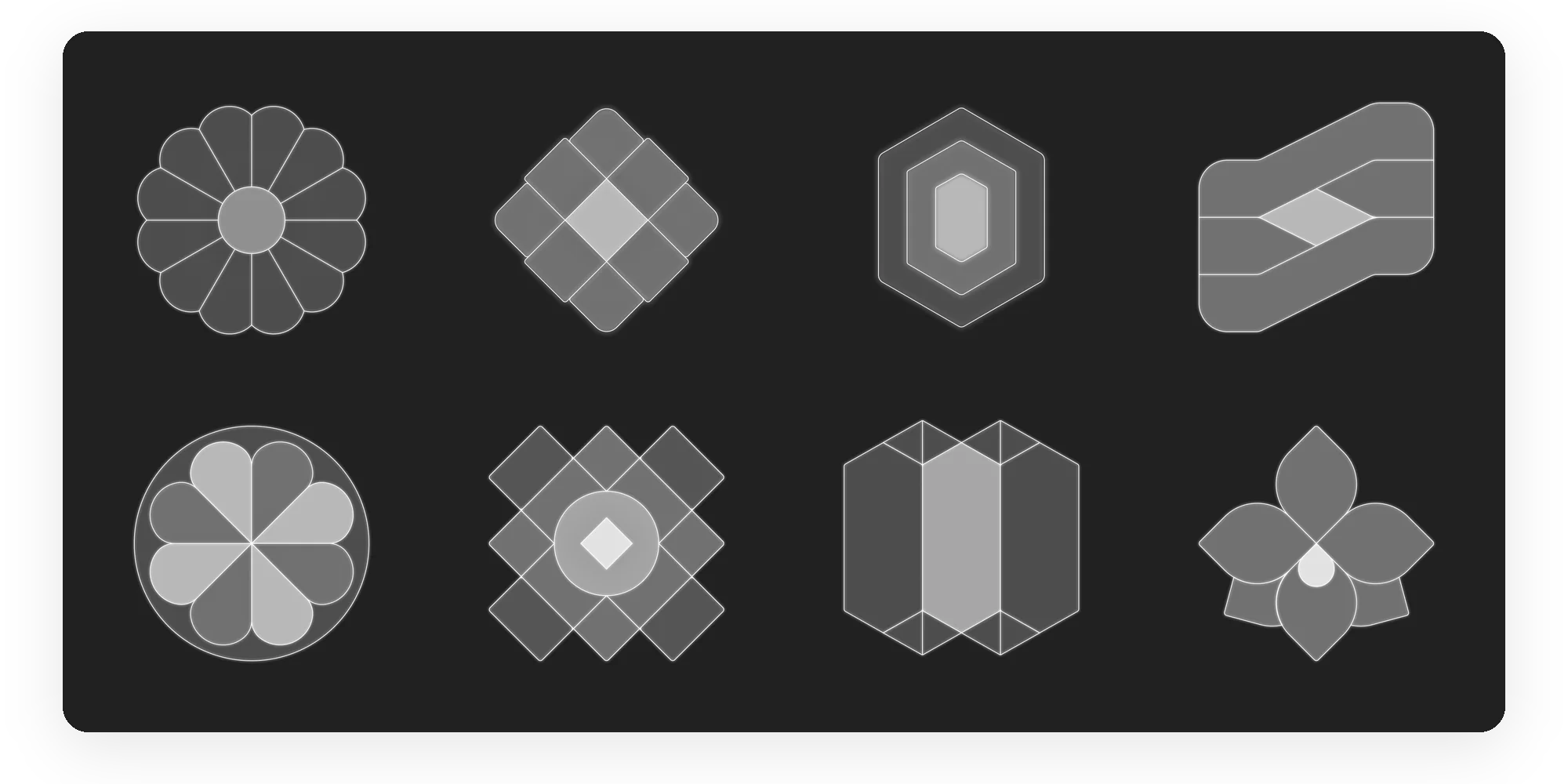
      In September 2026, the team at GovTech's Chief Digital Experience Office (CDXO) agreed to share with SGDS the Singapore motif system I'd designed for them. In October 2026 there was a request for AI-native SGDS components, and I sent a first version within the week. Later that month I walked the SGDS team through it. Language handling, user testing and accessibility checks come next.

      Eight Singapore motifs in pale line on a charcoal ground: tutu kueh, weave, shell, stairs, bahulu, tile, gate and orchid.
      Fig. 02The CDXO motif treatment set: tutu kueh, weave, shell, stairs, bahulu, tile, gate and orchid. In September 2026 we agreed to share the system with SGDS.
      06

      Why we're not copying GatherSG across as it is

      Copying it straight across would have been fastest, but we chose to audit it instead.

      A feature we chose not to build

      A straight copy of GatherSG

      Moving GatherSG across whole looked quickest. But it has no variables, so every component would need rebuilding before it could take a theme. Its contrast failures would end up in the shared baseline, and the two systems don't name things the same way. So the audit decides component by component: 28 to keep, 6 to improve, 8 to build and 12 to skip.

      The cost is speed. A straight copy would arrive sooner, but its failures would come with it.

      07

      What I can show so far

      Design systems rarely have one number to judge them by. Here's what I have, and where the evidence stops.

      How we defined success

      Every GatherSG product used the system, so a count of products tells you about the platform rather than the system. What I cared about was whether a new product could start from it, and whether a new designer could ship with it without making their own copy.

      The evidence

      • Case Connect went live in July 2021, eleven months after discovery started.
      • Every GatherSG product shares the system that started on Case Connect. HDB Contact Centre added patterns without forking it.
      • In September 2026 the SGDS lead took my audit as the base for a joint roadmap.
      • In October 2026 case management and AI-native components were picked as the first areas to add.

      Where it stops

      I have no numbers for speed, detached components or time saved. On SGDS nothing has moved yet. Next we need to agree the first phase and an end-of-year target, then track which teams use which components.

      08

      Variables, accessibility and a measurement plan on day one

      Two of the gaps I'm fixing now would've been cheaper to fix at the start. The third thing would have told me whether any of it worked.

      First, variables. Without them, DS 1.0 can't take a theme or move into SGDS without a rebuild. If I'd set up a small set in 2020, the 2026 work would just be mapping values.

      Second, accessibility. I'd build to WCAG from the first component and check each with screen readers, instead of flagging failures years later.

      And I'd agree up front how we'd know it worked: which components teams use, where they fork, how fast a new product reaches its first tested screen. We didn't track that on GatherSG. On SGDS I'll track take-up from the first phase.

      Next project06 / GatherSG / Service strategy and governanceHDB Contact Centre

      A contact centre where the best result on launch day was that fewer people needed to call.

      HDB Contact Centre

      I helped set the strategy for this contact centre from the start. The best result on launch day was that fewer people needed to call at all.

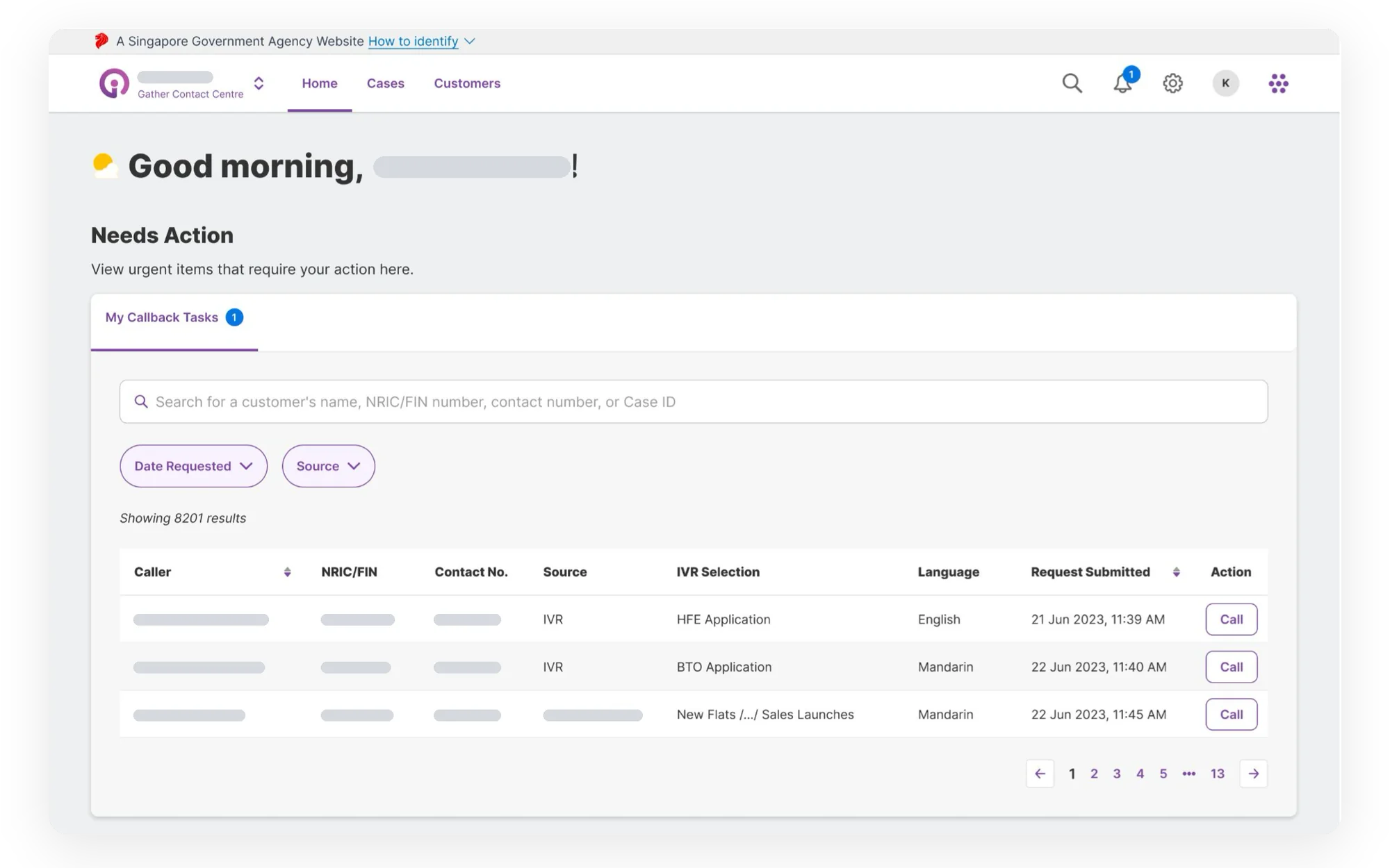
      The call agent's home page in Gather Contact Centre: a Needs Action section with My Callback Tasks, listing each caller's phone-menu selection, language, request time and a Call button. Names and ID numbers are greyed out.
      01

      Three systems open, and the same ID number typed into each

      The housing agency wanted fewer calls and better tools for its agents. Meanwhile, the phone system underneath was being replaced.

      Take a typical caller and call her Mrs Lim. She isn't real, but her question is common. She's buying her first flat and has sent in her HFE application, the eligibility check every new-flat and resale buyer starts with. A letter says some documents are pending, and she can't remember which she's uploaded. The portal's status screen doesn't quite answer her, so she phones.

      The agent who picks up has three or four systems open, which our research called system toggling overload. She types the caller's NRIC, their national ID number, into several of them. She files the call under one of many enquiry categories that are hard to tell apart. She knows nothing about the caller until they start talking. When the system crashes, she loses whatever she hadn't saved elsewhere.

      PlatformThe project ran under GovTech's Digital Service Programme and was built and released on GatherSG, the shared platform where I was UX Lead.

      The agency's goal, Contact Centre 2.0, had two halves: self-service that really saves residents a call, and agents with what they need in front of them. Taking calls off the phones only helps if the calls left reach agents who can handle them well.

      Underneath all this was a harder problem. The phone system ran on the agency's own servers. Part of the commitment was moving it to Amazon Connect, a cloud service. That wasn't design's job, but our releases had to line up with the switchover.

      02

      What I led, alongside the team

      I led the strategy, research direction and governance, working with the designers who made the screens.

      This was one of the main tracks in my UX Lead role. I worked with a team of designers who made the screens, and with engineering and operations, who moved the phone system and built the integrations. My part was the strategy and evidence around that work:

      • Strategy. I co-wrote the strategy factsheet with the product managers: goals and measures (the OKRs), the value we promised, and the problem.
      • Research. I planned it, and ran the usability test on the first working version, the MVP, myself.
      • Facilitation. I co-led the January 2024 priorities workshop, and redesigned and ran the data-analytics workshops.
      • Scoping. I helped write and present the April 2024 scoping deck.
      • Governance. I kept contact-centre needs from splitting the GatherSG design system, and built the ten-phase roadmap for after the MVP.
      03

      The vote put agents first

      The people who'd use the system every day ranked getting agents ready above the caller's experience.

      For six weeks in October and November 2023, our team sat beside the call and email agents at the customer service centre, watching how they handled each request and which portals they jumped between. By December we had a service blueprint of how things worked today, clusters of pain points, twelve problem statements and a map of how it should work. A supervisor could recognise their team's day in the blueprint without reading a report.

      Call agents struggled with switching systems, retyping, enquiry categories, too little caller information and tracking performance by hand. Email agents had no shared bank of replies, a 14-level eligibility check full of unclear codes, an editor that made replies inconsistent, and a system that crashed and lost their work.

      The priority vote

      The turning point was a workshop with the agency in January 2024. Everyone got four dots, at most one per statement, for whatever hurt their work most. Try it before you see how the room voted.

      Replay / the January 2024 dot vote
      The roomFour votes each

      Tap up to four statements, one vote each, then compare your picks with the room's.

      This shows seven of the twelve statements: the six in Fig. 01 below, plus peak-season queues. The other five took 7 votes between them.

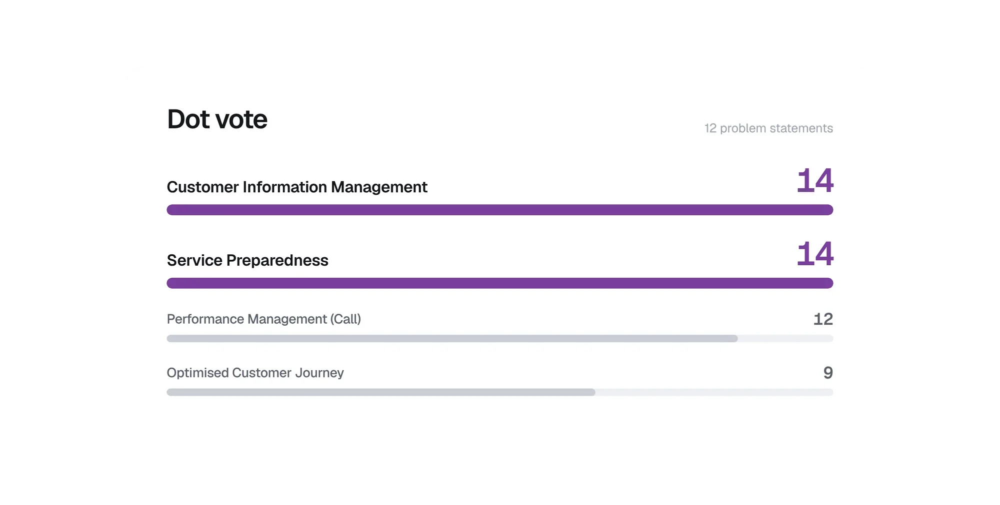
      Dot-vote results across twelve problem statements. Customer information management and service preparedness tie at the top with 14 votes each.
      Fig. 01The top six of the dot vote, redrawn from the results slide. Agent readiness came ahead of the caller's experience.

      I'd expected the caller items to win, because that's the story contact-centre upgrades tell. Instead two statements about getting agents ready tied for first. The caller's journey came fourth, and peak-season queues got nothing.

      1414customer information management
      1414service preparedness
      1212performance management
      99the caller's journey

      That gave the strategy its question: how do we take routine calls off the phones without leaving the hardest ones with the least prepared people?

      04

      Getting agents ready became part of the strategy

      The factsheet made two commitments. In April, a scoping workshop turned them into a release plan.

      The factsheet I co-wrote with the product managers did more for the team than any design document I made here. A year later, when people asked what belonged in Release 2, we went back to it and asked whether we were drifting.

      Its main goal was deflection: routine questions answered by self-service so they never reach an agent. After the vote I wrote in a second commitment. Any agent who still took a call had to be clearly better off. Otherwise the calls left over would be the hard ones, handled with the same scattered tools.

      Fewer calls would only help if the agents taking the rest were better prepared.

      Three levels, one recurring question

      In April 2024 we took the release plan and MVP to the agency's directors. Two ideas from that deck, which I helped write and present, shaped everything that came after. The first was a three-level model. Once the levels had names, we could answer a question that kept coming up: should the contact centre hold this data, or connect to the system that already does? The answer was almost always to connect.

      Level 3

      Application systemsThe record of truth for a flat application, eligibility or resale

      Level 2

      Central CRMRouting and general case management

      Level 1

      Contact-centre systemGeneral enquiries, interactions and correspondence. This product.

      Own the data, or integrate with it?  →  Almost always integrate.

      Fig. 02The three-level concept, redrawn from the April 2024 scoping deck. It gave "own it or integrate with it?" a default answer.

      Small releases on purpose

      The second idea was a pair of release rules: ship several smaller releases, and make no drastic changes to day-to-day operations. Smaller releases meant fewer hold-ups and room for staff feedback. Steady operations meant agents didn't have to relearn their job in a week. Both rules shaped every design trade-off that came after.

      Proof of conceptEveryone outside the selected group kept using the existing portal and case system for sales, resale and email.

      Release 1 was a proof of concept: HFE general enquiries only, for a selected few agents. Callers would choose the HFE option on the usual hotline and be forwarded to Amazon Connect and the new system.

      Self-service in the phone menu

      Deflection would happen in the phone menu. Working from 2023 menu figures and early-2024 enquiry data, we planned to add options for routine questions, keep the busy ones and retire five that hardly anyone used. The new HFE option would read out an application's status. If documents were pending, it would say how many. Then it would point the caller to the flat portal.

      The catch was proving who was calling. Callers had to give their NRIC and an application number, which many didn't remember. The plan moved the check into the phone menu, using Singpass, the national digital ID. Callers key in their NRIC and confirm with an SMS code or the Singpass app. Their verified identity then travels with the call to the agent.

      05

      The full caller record we chose not to build

      Agents asked to see everything about a caller in one place. The most generous way to do it would have tied the product to every system behind it.

      A feature we chose not to build

      Aggregate in

      Agents needed a cleaner view of the caller. Aggregate in would pull every field from every back-office system into one screen. Link out would show a quick-glance summary and let agents click through to the original system for detail.

      Aggregate in looked like what agents asked for. It also meant slower performance, too much data in one place, and a product tied to every system behind it. If someone added a field upstream, the API would change and we'd have to ship again. The 14-level eligibility check alone drew on 14 systems. I made the case for linking out on a one-page table, and the directors agreed.

      Aggregate inLink out Agreed
      Agent's experience
      • The most convenient in theory: everything in one portal
      • New screens have to be balanced against copying existing systems, or agents get confused
      • Less clutter: the quick-glance information that services most calls
      • "View details" opens the system of record in a new tab, so that hand-off has to be smooth
      Engineering cost
      • Performance and data-concentration risk
      • Deep coupling: a field added in a backend system means an API change, then a change on our side
      • Features that already exist elsewhere get rebuilt
      • Less coupling: integration points need fewer changes over time
      • Needs the agency's IT teams to smooth the jump to each linked page, logins included

      StrengthTrade-offRisk

      Fig. 03The one-page trade-off the directors agreed to, redrawn from the April 2024 deck.

      Pick an approach, then add a field to one of the 14 systems behind the eligibility check and see who has to act.

      Illustration, not real change data
      The 14 systems behind the eligibility check
      1. 01
      2. 02
      3. 03
      4. 04
      5. 05
      6. 06
      7. 07
      8. 08
      9. 09
      10. 10
      11. 11
      12. 12
      13. 13
      14. 14

      What the agent getsEvery field from every system, in one viewA quick-glance summary, with "view details" opening the system of record in a new tab

      When a field is added

      Aggregate in

      1. A field is added in one backend system
      2. That system's API changes
      3. The contact centre changes to match
      4. And ships a release of its own

      Link out

      1. A field is added in one backend system
      2. It shows on that system's own screen
      3. Agents reach it through "view details"
      4. Nothing changes on the contact-centre side
      Changes we'd have to ship0

      Nothing added yet.

      Linking out looks less generous, so the jump to each linked page had to be smooth. That meant working with the agency's IT teams on landing pages and logins. We applied the same thinking to three shared modules, including the 14-level check, which would be built once, centrally. That's why the product didn't become another copy of the systems it sat on.

      06

      Every screen traced back to a pain point

      We designed the workspace to answer the priority vote point by point, and kept today's ways of working wherever changing them wouldn't help.

      The design team built the workspace on the GatherSG design system. My part was keeping each decision tied to evidence.

      The View call and customer details step: a caller card marked Authenticated, with call type, time of call, waiting time, preferred language and the phone-menu selection HDB Flat Eligibility (HFE), above Customer Details with tabs for application records, flat records and interaction history. Names and ID numbers are greyed out.
      Verified through Singpass in the phone menu. No NRIC retyping on HFE calls.
      The reason for the call arrives with the call
      Summaries only. Each record links out to its own system.
      Fig. 04A call as the agent first sees it, from the April 2024 scoping deck. Each note links back to a problem from the research.
      Design moves01/06
      1. The call arrives with context
      2. No retyping the NRIC on HFE calls
      3. More than one category per case
      4. Callbacks and routing with history
      5. Closed means closed
      6. Email in the same workspace
      1. The call arrives with context

        The caller card shows whether the caller is verified, their phone-menu choice, language and waiting time. The agent isn't starting from nothing.

      2. No retyping the NRIC on HFE calls

        The NRIC from the phone menu brings up the customer's details, records and contact history. Each record is a summary that links to its own system.

      3. More than one category per case

        Agents can tag every category that applies. That only partly helps, because the categories themselves were unclear.

      4. Callbacks and routing with history

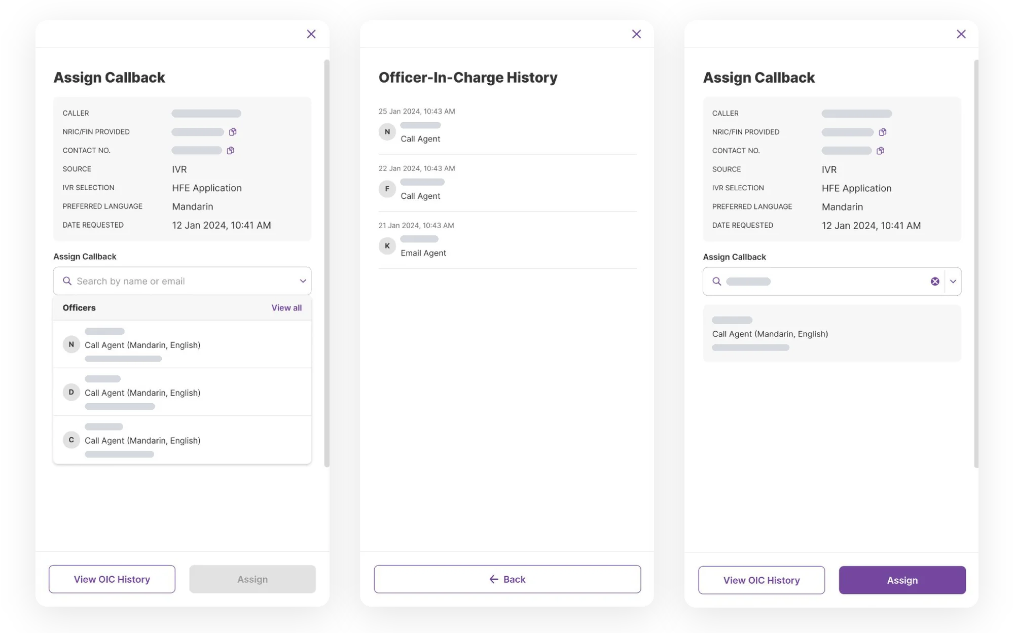
        Supervisors assign phone-menu callbacks to a named agent and can see who handled that caller before. Routing officers see every officer on a case and what they wrote.

      5. Closed means closed

        A case logged from a call shows as closed, as it does today, with any follow-up linked. This is one of the release rules, turned into a screen.

      6. Email in the same workspace

        Email agents had relied on their own Outlook archives. The email drawer puts the case beside the reply, with shared templates and attachments. Unsent drafts wait on the home page.

      Three drawers side by side: Assign Callback with the caller's phone-menu details and a list of call agents, the Officer-In-Charge History it opens, and Assign Callback with an agent chosen. Names, ID numbers and emails are greyed out.
      Fig. 05Assigning a callback, with everyone who's handled that caller one click away. From the April 2024 scoping deck.

      Testing the MVP myself

      I ran the MVP usability test myself because it would decide Release 2. It did. A couple of planned features moved down the list, because making the existing flows deeper mattered more than adding new ones.

      Shared words before shared data

      Self-help analytics for call managers only worked if three contact-centre teams recorded call reasons the same way. The first attempt stalled, because teams that share data worry about losing control of how it's read. I redesigned the workshops to settle two things first. Each team's data stays its own, and lining up is only about agreeing on names. And each centre starts from what it gets out of it. After two workshops, all three agreed to one shared structure.

      07

      Fewer calls, and calls that stayed down

      Release 1 went live on time. We defined success so that cutting calls couldn't come at the cost of a worse experience.

      Release 1 went live on schedule in late 2024: HFE calls only, for selected agents, and the agency's first move of a phone system to the cloud. That infrastructure was engineering's and operations' work. The two release rules, which design helped set, kept us on time. Release 2 followed in mid-2025 and brought email onto the same case screens.

      How we defined success

      Across GatherSG we measured experience first, then operations. Here the operational number was the goal, and that made experience matter more. A self-service option that fails sends the caller back to the phone, annoyed. Agents on Release 1 were assigned the system, so their usage proves little. Callers weren't assigned anything, so every self-service task was a real choice.

      A second usability test in March 2025, before Release 2, scored 100% task completion. A perfect score can mean an easy test. What backed it up was that every issue from the first test had been fixed or deferred for a stated reason.

      44.9%self-service adoption
      8,930calls deflected
      20%sustained fall in calls
      100%task completion, second usability test

      UX layer

      Ease of use
      4.6 out of 5 in the second usability test.
      Clarity
      4.5 out of 5 in the same round.
      Task completion
      100%.
      Against the old way
      The phone call.

      Operational layer

      Deflection
      The product's self-service adoption: 44.9%, or 8,930 calls.
      Volume
      A 20% fall in calls that held over time.
      Manual, repetitive, error-prone work
      No NRIC retyping on HFE calls. Three systems' lookups in one view.
      Supervision
      Self-help analytics for call managers.

      The 20% is the number I trust most. Self-service often gets a launch bump, then drifts back, but this one held.

      What the platform got

      Call-reason pickers, filtered tables for managers and agents, and the email drawer didn't exist in GatherSG before. Now other products on the platform get them ready-made.

      The screen that's hardest to design on one product ends up as a component the next product gets for free.

      08

      Measure where people give up, from day one

      We tracked deflection from the start. The design-quality questions behind it needed a plan and a routine of their own.

      I'd agree at kickoff how we'd track drop-off. We measured deflection and volume. I wanted to know where callers give up inside a self-service option, and whether each drop-off is a design, content or policy problem. Post-launch monitoring was in my roadmap, but the routine wasn't set before I moved on. Next time, design would own a measurement plan from day one, with a weekly slot to review it.

      I'd build tracking into the internal tools. Everything I heard said the agent tools worked, but that came from what people told us. We should have designed in tracking for time in the tool, which filters people used and which panels they ignored.

      I'd treat a data-sharing workshop as a question of trust first. The analytics workshops only worked once the format dealt with who controls the data.

      Screens are from the April 2024 scoping deck and use made-up data, with names and ID numbers greyed out. Names of the agency's internal groups and systems are left out.

      Next project07 / GatherSG / Discovery and handoffThree GatherSG products

      Service Connect, Feedback Management and Appeal Management: three products I started with research, then handed on for others to launch.

      Three GatherSG products

      I started three GatherSG products the same way, all on one shared design system. Each time, I handed the product to the designer who'd launch it.

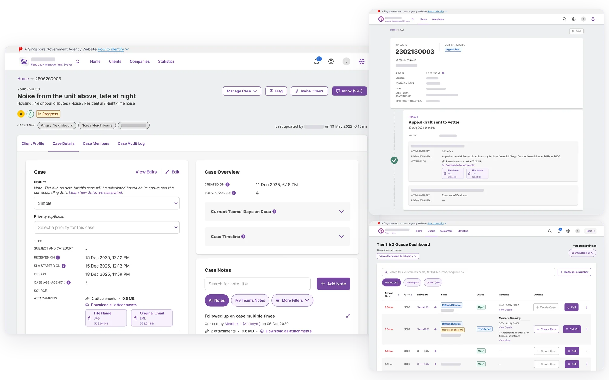
      Case work on GatherSG across three products: a Feedback Management case page with its details, overview, timeline and notes; an appeal in Appeal Management with its phases; and the Service Connect officers' queue dashboard. Names and agency details are hidden.
      01

      The designer sent in first

      From 2021 to 2025, much of my GatherSG work was starting products and handing them on. Here are three of them.

      When a client brought GatherSG a problem that was unclear or spread across agencies, I was often the designer sent in first. My part was discovery: scoping, fieldwork, getting people to agree and setting a first design direction. Another designer then took the product to launch, and I started the next one.

      Service Connect is the system behind the government's walk-in service centres. The Feedback Management System (FMS) handles public feedback across agencies. The WOG (whole-of-government) Appeal Management System (AMS) tracks cases from Meet-the-People Sessions, where residents take problems to their MP.

      Scale todayGatherSG reports 17 product tracks, more than 25,000 users and over 2.2 million cases. These are figures for the whole platform, not my results.

      I'd started the GatherSG design system on its first product, Case Connect. By now the whole team built on it, with weekly huddles keeping four or five products consistent. So when I handed a product on, the next designer got a brief, a direction and a system they already knew.

      02

      Three roles, but my part always stopped at the same point

      My grade changed over these years, so what I can claim depends on the date. Where my part ended didn't change.

      1. January 2021

        Became UX Designer (II).

      2. July 2021

        Case Connect goes live, and its design system becomes the base for what follows.

      3. April 2022

        Service Connect goes live.

      4. May 2023

        Became UX Lead on GatherSG.

      5. April 2024

        Became Senior UX Designer.

      6. September 2025

        Moved from GatherSG to a new team.

      I did Service Connect's discovery as a UX Designer (II), between Case Connect's launch and Service Connect going live. On all three products, my part stopped at discovery and the first design direction.

      Other designers took the screens to launch. The Service Connect design file lists seven designers, me among them, and another designer designed Appeal Management's interface.

      Before becoming UX Lead, I'd set up the team's DesignOps: rituals, file hygiene, component rules and handoff habits with engineering. From May 2023 I managed six designers across three product teams, plus the design system champions. The team peaked at 14.

      03

      People got lost between the screens

      The walk-in centre had more than twenty agencies under one roof and two levels of service, with four screens that had to work as one system.

      Service Connect was for an Integrated Public Service Centre, where citizens deal with more than twenty agencies in one building. The first centre was our testbed and the first site on the system.

      Tier 1 is self-service at a kiosk. Tier 2 is a counter: take a number, wait, get called and work it through with an officer. The officer also points out schemes the citizen qualifies for but hasn't claimed.

      01

      Repeating

      Citizens tell the same story at every touchpoint

      02

      Uncertainty

      People don't know what support exists

      03

      Manual

      Admin processes and workflows done by hand

      04

      Fragmentation

      No shared view of a citizen's needs across agencies

      Fig. 01The four problems the service-centre work set out to fix, redrawn from the 2025 Public Service Learning Festival slides.

      That meant four screens built as one system: the kiosk, the officers' queue tool, the waiting-area TV and the counter tool.

      What discovery changed

      This was GatherSG's first product whose users weren't only on a laptop. The big change was treating the whole centre as one service, and designing the moments between screens as carefully as the screens themselves, because that's where the worst failures happen.

      We watched citizens get stuck at the entrance, stall at the kiosk, miss their number and get sent elsewhere at the counter. Each breakdown became a design problem.

      Both tiers also had to share one system. With separate tools, officers would have had to re-enter what the kiosk had already collected.

      The officers' queue dashboard: waiting, serving and closed tabs, the counter the officer is serving at, masked NRICs, and Create Case and Call actions on each row.
      The counter set here is the one the TV calls
      One queue, three states, shared by every counter
      Kiosk and counter share one record. The case starts from the queue.
      Fig. 02The officers' queue dashboard as it shipped, built by the wider team after I handed it on. Each note traces back to one finding: one system for both tiers. Sample data.

      Here's one gap, between the queue tool and the waiting-area TV. Pick a counter, call the next number and watch both change.

      Sketch / two surfaces, one queueSample tickets. Simplified, not the shipped logic
      Officer's queue tool
      Now servingS010
      Waiting

        The officer at counter 07 has just called S010.

        Queue Number正在服务Counter/Room服务柜台
        1. S01007
        2. S00810
        3. S00609
        4. S00502
        5. S00403
        Queue Number正在服务Counter/Room服务柜台
        1. H004H23
        2. L00424
        3. S00225
        4. R02326
        5. M00427
        Missed Queue错过了叫号
        1. B004
        2. A032
        3. A033
        4. A010

        Missed your queue? Please approach any of our officers at concierge for further assistance.

        Handoff

        I handed on a service blueprint, a map of the four screens as one system, and prototypes of the kiosk and queue flows. Service Connect went live in April 2022. It then spread from the testbed to centres across Singapore.

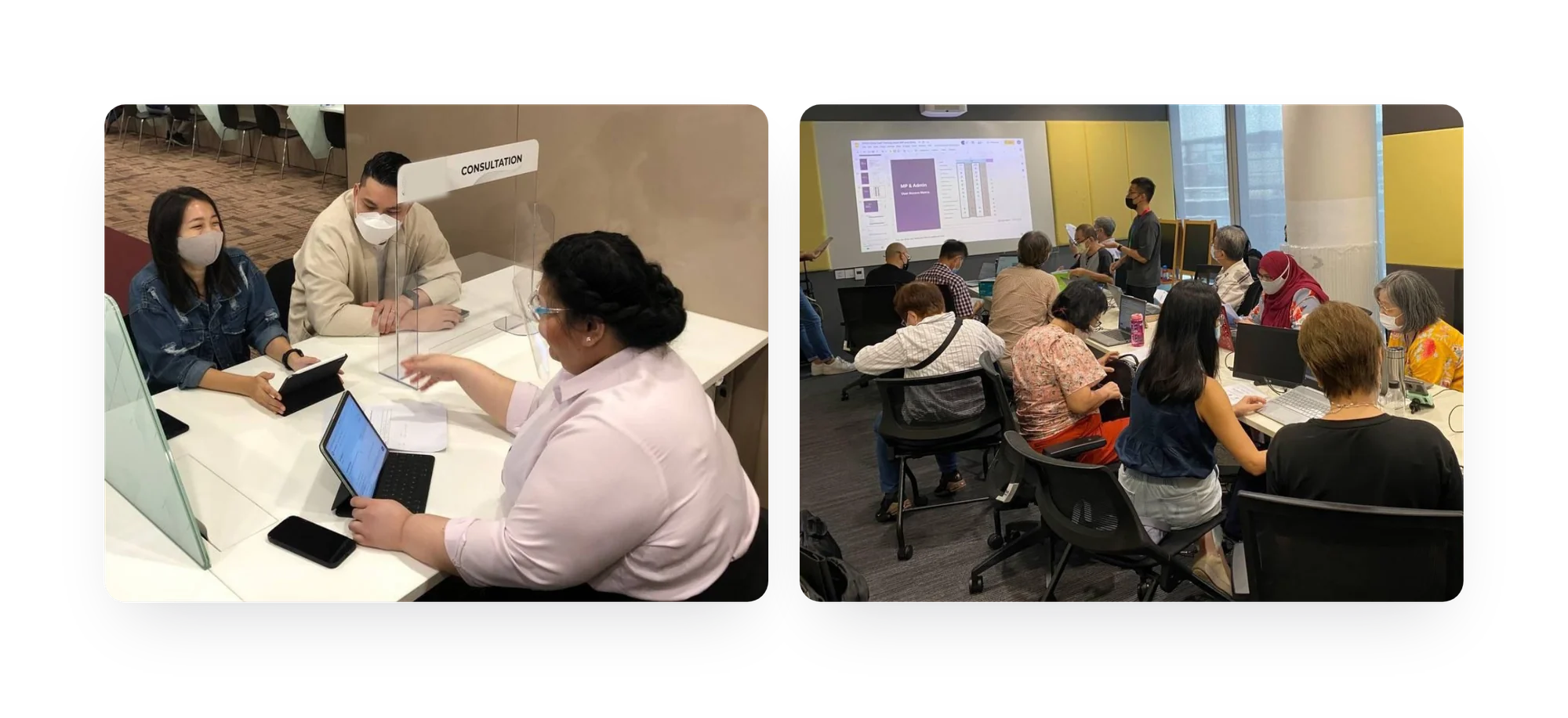
        Testing Service Connect at a service counter with officers, and a training session.
        Fig. 03Testing at a counter with officers, and training officers. Shown at the 2025 Public Service Learning Festival.
        04

        Seventy to eighty per cent the same product

        There were two groups of agencies, a contract running out, and hand-overs between agencies that nobody clearly owned.

        FMS was commissioned by a central body that runs systems for the whole public service. It turned out to be two problems in one. The brief described the first: more than twenty agencies shared a contract for a commercial feedback platform that was coming up for renewal, and many of its features went unused.

        Research found the second. Many agencies had no system at all, just shared inboxes worked by hand. When a complaint touched two agencies, one emailed the other. Who replied to the citizen was settled case by case, with no shared record.

        Two strands, read together

        One strand was a fit-gap analysis of the old platform, feature by feature: what was used, what sat idle, and what could be replaced by something simpler on GatherSG.

        The other was interviews and workshops with both groups of agencies on how they really sorted, escalated and closed feedback. We followed cross-agency cases end to end: who opened, owned and answered them.

        Rule of thumbA feature only mattered if agencies used it. A way of working was only worth designing for if more than one team needed it.

        Read together, the two strands showed that the biggest opportunity was cross-agency feedback, which had the same shape as Case Connect's referrals.

        A citizen doesn't know which agency is responsible for their problem, so the system has to work it out for them.

        Feedback management turned out to be 70 to 80% the same product across agencies. The rest is where agencies really differ: policy, escalation, and what "closed" means. That ruled out both one rigid system and twenty custom ones.

        1. A common core

          The shared 70 to 80% is built once, so agencies coming from the old platform and from email all move onto one product.

        2. Settings at the edges

          Agencies get their own settings only where research showed real differences.

        3. A proper place for hand-overs

          Passing feedback to another agency happens in its own place in the system, instead of in follow-up emails.

        Handoff

        I handed on the fit-gap analysis and the split of agencies into two groups. I also handed on a first information architecture, which split the core from agency settings and gave referral its own place. FMS is now live as the WOG Feedback Management track.

        05

        The paper was doing four jobs

        Sitting through the sessions showed why paper had lasted so long.

        At Meet-the-People Sessions, residents bring MPs problems with housing, jobs, health and money. Each becomes a case that goes to an agency and should end with a reply. For decades nothing tracked them consistently. Some lived in spreadsheets. A lot lived on paper.

        We sat through whole session nights, from residents signing in to the few cases passed up to the MP.

        A volunteer typed notes, then printed copies to sign, to post to agencies and to file. Staff relied on those folders when a case came back years later.

        The paper was doing four jobs at once: taking notes, getting signatures, posting letters and keeping records. A digital system had to respect what the paper was being used for.

        1. Taking down a case in a minute or two

          Session nights are rushed, so if intake took any longer than that, volunteers would go back to paper.

        2. One case, three kinds of user

          Volunteers take cases down, staff follow up, the MP decides. One tool had to serve all three.

        3. The reply closes the case

          A case closes when the resident has an answer, so the letter, the signature and the posting are each tracked as a stage.

        Handoff

        I handed on the fieldwork, a paper-process map, a draft access model for the three roles and an intake prototype ready for usability testing. AMS now runs across all of Singapore's constituencies.

        06

        I handed off before launch, so the test is whether the new thinking lasted

        The fair way to judge my part is whether each change in thinking survived once another team took it on.

        Use of all three is required, so high usage says little about design. You'd see the same number whether the product helped or got in the way.

        Resolution time, volume and workarounds only mean something after launch. In discovery, you set up the work so the next team can measure them.

        Did the new thinking survive?

        Pick a product to see what I handed on, and what was still there at launch.

        Service Connect

        In the handoff
        • The service blueprint, drawn
        • The four screens mapped as one system
        • Kiosk and queue flows at prototype fidelity
        What survived the build

        The four screens shipped as one system, and the moments between them stayed a priority in the build. The queue dashboard in Fig. 02 shows it.

        The wider team built it out, and it went live in April 2022.

        FMS

        In the handoff
        • The fit-gap against the old platform, documented
        • Agencies split into two groups: those on the old platform, and those on email
        • A first information architecture that split the shared core from agency settings, with a place for cross-agency referral
        What survived the build

        The two groups and the common core both made it through the build. Cross-agency handoff made it in as its own part of the product.

        Another designer took it to launch. It's live as the WOG Feedback Management track.

        AMS

        In the handoff
        • The fieldwork, written up
        • The paper process, mapped
        • A role-based access model drafted for volunteers, office staff and MPs
        • The intake flow, prototyped far enough for usability testing to pick it up
        What survived the build

        The limits we learned from the paper process made it through handoff: intake that fits a volunteer's minute or two, and the reply to the resident tracked as its own stage.

        Another designer made the design file and the shipped screens. It's rolled out across all of Singapore's constituencies.

        What the teams who took over measure

        These numbers belong to the teams who took the work on, not to me.

        91,00091,000Service Connect referrals across 190 services from 23 agencies
        100,000+100,000+Service Connect transactions in an average month
        8585service delivery agencies receiving and answering appeals in AMS
        ~80,000~80,000appeals a year through AMS
        FMSThere are no figures by agency or by volume that can be shared yet.

        As of mid-2025, Service Connect is the single system for 9 service centres and 39 hotlines across 14 agencies. It has tracked 700,000 cases and serves around 88,000 citizens a month. More than 90% of MPs use AMS.

        07

        What starting things taught me, and what it cost

        I got good at the first weeks of a product, but I didn't see enough of the year after.

        Doing this again and again taught me to run discovery under real limits, understand the client and hand over so the next designer doesn't start again. Service Connect showed me a building is something you design, like a screen. FMS taught me to test a commercial product honestly against real use. AMS taught me to respect what paper was doing before the system arrived.

        The trade-off was that I handed each one on before launch, so I learned more about starting products than shipping them.

        Starting a product well is a senior skill, but so is seeing one through to launch.

        What I'd do differently

        I'd agree a measurement plan with the client at handoff: three or four signals tied to what discovery expected to change, so the next designer doesn't have to make up the scorecard.

        And as a lead, I'd follow at least one product a year from discovery to the months after launch.

        Agencies are described by what they do, not by name. The screens and photos shown are the work of the teams who took over, with sample data.

        Next project08 / GatherSG / Multi-agency case coordinationCase Connect

        For when one person needs help from five agencies at once. It was the first product on what became GatherSG.

        Case Connect

        One family could be working with five agencies at the same time. Each agency could only see its own part of what the family was going through. We built a shared case that all five agencies could work from. To build it, we made a design system first. That design system later became the base for all of GatherSG.

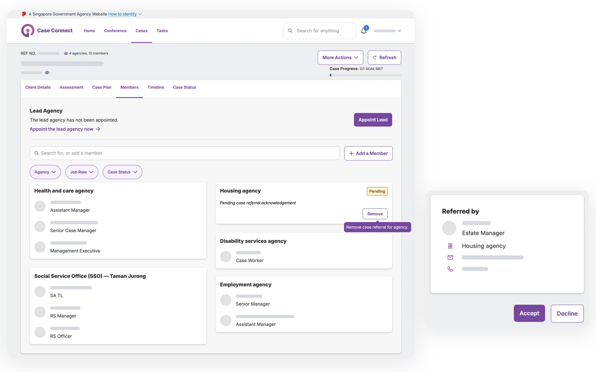
        Case Connect design screens. The Members tab of one shared case shows a lead agency not yet appointed, Add a Member, and cards for five agencies, each listing its caseworkers by role; a housing agency's referral is still pending acknowledgement, with a Remove button. Beside it, the receiving agency's view of a referral shows who referred the case, with Accept and Decline buttons. Names, ID numbers, case numbers and contact details are grey bars, and agencies other than MSF's Social Service Office are given generic names.
        01

        Five agencies, one family, no shared record

        Cases fell apart between agencies, and in August 2020 MSF asked for a platform to fix that.

        Take Mr Tan, a made-up case built from typical ones. He's out of work, his wife is bedridden, and they're behind on rent for their rental flat. There's also a child-protection concern. That's housing, employment, health, family services and child protection: five caseworkers and five sets of paperwork.

        Each agency handled its own part, and nobody saw the whole family. Caseworkers re-explained the case to each other by phone, updates sat in scattered emails, and much of the coordination ran through messaging threads that weren't secure enough for case data. When work got dropped between agencies, the people behind it got dropped too.

        CCRMCase Connect's official name was Case Coordination and Referral Management. A referral meant passing one client to several agencies within the system.

        Circuit Breaker, Singapore's 2020 lockdown, made it urgent. When it stopped paper-based outreach, a product manager (PM), a UX Lead and I adapted GALE's case-management system for MSF's outreach. I was the primary designer. That work showed how wide the gap between agencies was. In August 2020, MSF asked GovTech for a platform where social workers and partner agencies could share one case. There they could refer a citizen to several agencies and see what the others had done.

        2019

        GALE emergency response

        A shared case system for emergency alerts

        2020, Covid-19

        Repurposed for outreach

        Case Connect came out of this gap.

        2022

        Service centres

        One citizen experience across several touchpoints

        2025

        GatherSG platform

        A shared backbone across government

        Fig. 01The lineage Case Connect grew out of, redrawn from the 2025 Public Service Learning Festival slides.

        Every agency had its own workflow, rules and idea of what a "case" was. And the people doing the work were busy, so a new system had to earn its place. The product would only matter if agencies used it.

        02

        Primary designer, starting at the most junior grade

        What I owned on a team of three, and what others owned.

        The core team was a UX Lead, a PM and me. I was the primary designer, a UX Designer (I) until January 2021 and a UX Designer (II) after that. I owned the design system: the shared kit of colours, components and layouts every screen is built from. I also owned the screens and the prototypes we tested.

        All three of us ran the research phase, called discovery. We took turns leading sessions, so I led some workshops myself. I worked alongside the UX Lead and PM, who led the project. I also worked with MSF, which owned the programme plan and its targets.

        03

        Six weeks, eighteen agencies, one question

        Two workshops in August 2020, and the idea that came out of them: a case has one record, shared by many parties.

        1. August 2020

          MSF asks for the platform. Research starts.

        2. August 2020

          Two workshops: MSF and its social-service arm, then eighteen agencies.

        3. September 2020

          Findings presented. Design and build start.

        4. July 2021

          Case Connect goes live.

        We had six weeks, and the centrepiece was two workshops on one day. In the morning, more than twenty people from MSF and its social-service arm set out what the product should achieve and mapped how complex cases were handled, gap by gap.

        The afternoon brought in eighteen agencies and more than fifty people. They ranked what blocked good work, sketched ideas, storyboarded the best and dot-voted. Trade-off sliders made us clear about what we'd build and what we'd cut.

        That room taught me that each agency brings its own professional language, and the screen has to work for all of them without talking down to any.

        We had to work out what it means for a case to be "owned" when five or fifteen agencies are working on it.

        Before Case Connect, no one held the whole case. We settled on one record shared by many parties: each agency sees and acts on its own part, and the case stays shared. The first user flows came from that. Referral, which means sending one client to several agencies inside the platform, became the core of everything that came after. We presented in September 2020 and went straight into design and build.

        04

        One record, many parties

        We made four decisions between September 2020 and July 2021, and the first was a design system nobody had asked for.

        On a team of three with screens to ship, building a design system first needed a reason. There were two.

        1. Design system first

          One case showed up on many screens: case lists, referrals, each agency's view, status updates, the record of who did what. Without a system, our few hours would go on consistency while the hard problems waited. The second reason mattered more: one record with many parties kept turning up across government, in community-link work, queues, appeals and feedback.

        2. Referral at the core

          When one agency refers a case, the next agency receives it inside the same system, not as a hand-over into someone's inbox. A caseworker creates the case once, then brings in each agency the citizen needs.

        3. A view for the receiving agency

          We designed what a caseworker sees when a referral arrives in their queue. The platform doesn't pretend the agencies are one organisation. You can still see where one agency ends and the next begins, but the record of who's responsible is on the platform, not in a phone log.

        4. One shared case timeline

          Several overlapping cases became one. A caseworker opening it sees the agencies already involved, so Mr Tan doesn't have to tell his story again.

        Try it with Mr Tan's case. Bring in the agencies he needs, then switch to the old way.

        Mr Tan's case, illustrated · not the product's screens

        Bring in an agency

        1shared record, 5 agencies on it

        Shared case timeline

        1. A caseworker creates Mr Tan's case once.
        2. Each agency is referred in inside the platform and joins the same case. It sees who's already on it and works its own part.

        We prototyped each flow in Figma and ran two rounds of usability testing with social workers and partner agencies. Round two checked that round-one problems were really fixed, not covered up. Where they weren't, we went back to the design. A flow only earned its place if a social worker would rather use it than go back to email threads, an insecure messaging group and phone calls.

        05

        Everyone asked for chat. We tested it and said no.

        The clearest design decision on the project was something we didn't ship.

        A feature we chose not to build

        In-built chat

        Agencies kept asking for chat inside the product, to replace the email and messaging threads they coordinated on. Those channels weren't secure enough for case data, so chat looked obvious. The product owners wanted it too.

        We prototyped it and tested it anyway. The answer was clear.

        The request

        Build an in-built chat

        Agencies asked for it, to replace channels that weren't compliant, and the product owners wanted it.

        What the prototype test found · tap each finding to weigh it

        Build itDon't build
        Not built

        All four point the same way. Nobody would log in to read it, and the other agencies wouldn't be there to answer.

        We chose not to build it. Chat would have been expensive, highly visible and empty, and an empty feature makes people trust the rest of the product less. The research let us say no with evidence, because finding out whether the need was real was the reason we ran it.

        Sometimes the most senior thing a design team can do is say no, with the evidence to back it up.

        06

        Live in July 2021, and built on for years after

        The design system underneath outlasted the project.

        Case Connect went live in July 2021, eleven months after research began. The principle was that any government agency a citizen deals with can be referred in. Agencies kept joining, including the corrections service and the bodies that handle retirement and tax.

        The bigger story is the design system. It became the base of GatherSG, GovTech's platform for agencies to manage cases together. Case Connect now sits there, linked with ComLink+. Alongside it are the WOG Appeal Management System, the Feedback Management System, Gather Queue, Service Connect, HDB Contact Centre and PA PRISM+. They all share the components that started here. I kept developing the system until I moved off the platform in September 2025.

        The thing you're working on today might not be the one that matters later. Build it so someone else can pick it up.

        07

        Joining isn't the same as using

        This project had to happen, so here's how we judged it, and which numbers actually say something about the design.

        How we defined success

        MSF owned the programme targets, and agencies joined because MSF asked them to. So a count of agencies joining says little about the design. And joining didn't mean using, since caseworkers could still use email.

        So we measured experience first, then operations. After launch we built a dashboard tracking users, transactions and time taken. I used it to check our design: were people well served, or were they working around it?

        User experience

        Ease of use
        Round-one problems fixed by round two of testing.
        Satisfaction and recommendation
        Whether referrals passed agency to agency on the platform instead of by email.
        Compared with the old way
        Whether social workers chose the main flows over email, messaging groups and phone calls.
        Problems found in research
        Whether the workshops' top blockers were fixed, or, like chat, left out with evidence.

        Operations

        Manual, repetitive, error-prone work eliminated
        Emails and phone calls replaced by one shared case.
        Time to resolve a case
        How long each case took to get from a five-agency problem to an answer.
        Referral volume and spread
        Whether the platform carried real work, or agencies joined and went quiet.
        Working around it
        Caseworkers drifting back to email, which is a design and change problem that looks like low take-up.

        What the dashboard showed

        2525entities onboarded by 2022
        400+400+active users by 2022
        1,000+1,000+case referrals on the platform by end 2023
        40%40%less time on coordination, from a later evaluation by colleagues
        The 40%Reported in a later evaluation by colleagues on the platform, and written up separately. I didn't run it.

        The first two numbers show agencies joining and people signing in. The referrals and the 40% show real work where the platform was used. Some agencies also kept coordinating by email and WhatsApp, because they didn't have to move.

        08

        Good design didn't guarantee use

        We built what agencies asked for and tracked the right data. But someone had to own reading that data and making the switch stick.

        The dashboard tracked the right data. Take-up and volume were easy to report. The design questions needed someone paying attention months after launch:

        • Where do users give up partway through making a referral?
        • Which agency views are going unused three months in?
        • What does a healthy case timeline look like, and what does an unhealthy one look like?
        • Which agencies stopped using it after joining, and why?

        I wasn't that designer, because I'd moved to a new project. Next time I'd agree a measurement plan at kickoff, owned by design, with those questions and a regular slot to read the answers.

        The bigger lesson came later. We built what agencies said they wanted, and some still kept to email and WhatsApp. Good design on its own didn't get them to switch. Now I ask early who will make the switch stick, and plan that change alongside the screens.

        Mr Tan is a composite of typical cases. Agencies other than MSF are described by what they do. Case Connect's own screens aren't shown because I no longer have access to the original design file. The hero shows a component from GatherSG Design System 1.0, the system's later version.

        Next project09 / GatherSG / Service design and hardwareGALE

        A wireless alert button for seniors who live alone, and the 24-hour response that has to come when they press it.

        GALE

        GALE is a red button for seniors who live alone, and the round-the-clock help behind it. It taught me my first lesson about designing for government: the button was the smallest part of the job.

        The operator's floor plan of a block: blue and white units either side of a corridor, lifts and stairs between them, alert flags on several units and the unit that pressed in red. Sample data.
        01

        The cord was there, but nobody could reach it

        Seniors living alone already had an emergency system. It went off by mistake so often that they'd tied it out of the way.

        Singapore is ageing fast. Homes with one person aged 65 or over rose from 42,100 in 2014 to 87,200 in 2024. Seniors living alone are on track to double the 2016 figure by 2030. Surveys show they'd rather grow old at home, even alone, than move into care. So what happens when one falls in the bathroom at night?

        In public rental flats, the answer was a pull-cord from the late 1990s, usually in the bathroom. The lightest touch set it off: a gust of wind, or someone brushing past. The people answering it fielded dozens of false alarms a week.

        A red pull-cord alarm in a rental-flat bathroom, and a close-up of the knot that ties it up out of reach.
        Knotted up, out of reach from the floor
        Fig. 01The old pull-cord in a rental-flat bathroom, tied out of the way, where nobody who'd fallen could reach it.

        So seniors coiled the cord up near the ceiling. That stopped the false alarms. It also meant that when someone really did fall, she couldn't reach it. A system meant to reassure people mostly frustrated them.

        The cord failed either way. Left hanging, it raised false alarms all week. Tied up, it stayed silent when someone really fell. Switch to the button we built to see what replaced it.

        Two ways the cord failed, and the button

        DozensZero false alarms a weekfalse alarms, effectively, in the 100-senior pilot

        Scenario 1: the cord left hanging

        1. 01

          A gust of wind or someone brushing past sets it off.

        2. 02

          The alarm alerts the officers on duty at the seniors' centre, who go out to attend to it.

        3. 03

          It's a false alarm. That happens dozens of times a week.

        Scenario 2: the cord tied up

        1. 01

          Seniors coil the cord up near the ceiling, and the false alarms stop.

        2. 02

          She falls. The cord's out of reach.

        3. 03

          No alarm goes off, so nobody knows. A real emergency goes unnoticed, and some seniors may not have survived one.

        With the alert button

        1. 01 A press nobody meant

          The blue cancel key and install-day training catch curious presses. Nobody's sent out.

        2. 02 Day to day

          It stays on the wall by the bed and in the bathroom, and can't be switched off without tools.

        3. 03 She falls

          She presses it. The alert goes to staff at a seniors' centre, or to a tele-care line out of office hours.

        4. 04 Getting help

          Their screen already shows her unit and room, who lives there and her next of kin. They accept the case and talk to her through the button.

        Whether a senior can stay at home depends partly on reaching someone who'll come. That's a service question. GovTech's answer was the Government Assisted Living Ecosystem, or GALE. Its most visible part was a red button we called the Personal Alert Button.

        02

        My first government project, as an associate designer

        What the team did, and my part in it.

        I worked on GALE from November 2019 into 2021. I was a UX Designer (I), the associate grade, until January 2021, then a UX Designer (II). A UX Lead led the design. As a team, we researched with seniors in their homes and tried the button in many shapes and sizes. We designed the system operators use to handle each alert, and worked out with the partner agencies what happens after a press. Then we ran a small trial and helped get the first rollout done.

        My own part was interviewing seniors, helping them start using the button and installing buttons in their homes. I also improved the case-management system round by round through usability and acceptance tests.

        03

        From a better cord to someone who shows up

        We started by asking how seniors could better call for help. The research moved the question to what happens after they do.

        Research opened with a workshop that brought the agencies in early. We ran focus groups and mapped the service as it worked then. We listed risks and dependencies, sketched storyboards and ranked what the system had to do. We later called this shifting left.

        Then we went into homes. We noted where the phone sat, where the medicine was and where her glasses were at night. We asked what she'd do if she fell, and listened for the honest answer rather than the polite one.

        Mostly, seniors told us their life stories. Some of those stories changed where the buttons went. One senior described a fight along the corridor outside the flat. A button inside the home would have been out of reach. But a neighbour they were close to could reach through the gate and press a button near the entrance. And a neighbour who saw them in danger in the corridor could raise the alarm on their behalf. So we considered the entrance when we installed buttons.

        Many seniors also wanted their buttons mounted high up. We advised never to put one above knee height, so that someone who'd fallen could still reach it lying down.

        How might we design a system that empowers seniors to age gracefully and independently in their own homes?

        Those visits showed me that ageing in place rarely meant thriving. More often it meant getting by, one fall or one missed call from something worse. A better button was needed, but it would only be as good as what came after a press: who answers, how they find her flat and who gets her to hospital. So we designed the service first and the hardware second. For the hardware, we studied alert buttons already on sale, then worked through a run of 3D-printed prototypes.

        04

        The service was the product, and the button set it off

        We designed the response first, then the button and screens to support it.

        With the product team, operations staff and partner agencies, we designed a response in four stages: activate, verify, triage and respond. Press the button below to walk through them.

        The device is a chunky white box with a red button on the front and a blue cancel key on the side. We tested whether arthritic fingers could press it, whether seniors could hear it confirm, and whether it could go off in their sleep.

        The Personal Alert ButtonInteractive

        One press, four stages

        Press the red button to walk through the response we designed behind it. The blue one on the side takes it back.

        1. 01 ActivateThe alert arrives in the case system

          It goes to centre staff in office hours, and to a hospital-run 24-hour tele-care line the rest of the time.

        2. 02 VerifyThe operator talks to her through the button

          If she doesn't answer, they call her phone, then her next of kin, or someone visits.

        3. 03 TriageThe lift-lobby panel goes off

          A strobe and siren on the ground floor tell neighbours, in four languages, which unit and room needs help.

        4. 04 RespondThe ambulance takes her to hospital

          In a real emergency, the national ambulance service takes her to the nearest hospital. Some cases go to the police.

        Within that response, these decisions mattered most.

        1. A press you can take back

          There's a separate blue cancel key, and we trained seniors on both buttons on install day.

        2. Speak through the button itself

          A senior on the floor can't reach a phone, so the buttons have their own 4G connection. The residents' leaflet put it in three steps: press, tell, wait for help.

        3. The case arrives filled in

          Each press logs the date, time, room and who pressed it. It sounds a siren in the system and shows staff the fastest lift lobby or stairwell to the door.

        4. One action to accept, and it's timed

          Accepting is one large button with a timer running. Each centre saw its time to accept and to close next to the national average, which gave staff a reason to move quickly.

        5. Neighbours as first responders

          The lobby panel names the unit and room in four languages.

        6. No case closes without a record

          Whoever accepted the case records what happened before closing it.

        The operator's case screen for Case 124: the button pressed from the kitchen, the number to speak through the button, two household members with one marked No Phone, and a red Accept Case button with a timer. Beside it, personal and medical details, the next-of-kin card and a case timeline showing a cancel press. Personal details are greyed out.
        Where the press came from, before anyone speaks
        One interaction to accept. Time to accept is benchmarked.
        Personal and medical details, ready before the call
        Fig. 02What the operator sees after a press, rebuilt from the case screen GovTech showed at the 2025 festival. Personal details are greyed out and the phone numbers are sample data.

        A system that had to work on the night shift

        At 2am, the operator has usually never met the senior. Within seconds she needs to know where the press came from, who lives there, their health and next of kin, and she needs one way to accept. The screen flags a resident with no phone. It shows hearing, speech and mobility, because each changes how the call will go. And it logs a cancel press in the timeline.

        We interviewed centre and tele-care staff and tested detailed mock-ups over several rounds before it was built.

        05

        A hundred homes, then fifty-three blocks

        We tested every step with real seniors in their own flats before going wider. I put some of those buttons on the wall myself.

        We ran a proof of concept with 100 seniors in Tampines rental blocks. It measured the old system against ours and checked how staff would run it.

        We tested each link: press, alert, screen, voice call, record. An operator can't judge a fall through noise, so we kept improving it until we trusted the audio. The device couldn't be switched off without tools, and it reported its own low battery.

        The install visits

        The rollout only worked if seniors trusted the device. So we ran briefings and training, handed out a leaflet with the three steps and helped seniors get started.

        A team member's hand holding the button against a tiled bathroom wall during the pilot.The lobby strobe display announcing a unit that needs help, in four languages. Unit number blurred.
        Fig. 03Putting up a button during the pilot, and the lobby panel that tells neighbours which unit needs help. The unit number is blurred.

        In nearly every flat, one question came up. Seniors didn't ask about signal or batteries. They wanted to know whether anyone would actually come. We could say yes, because the people and processes behind the button had been designed as carefully as the button.

        The programme aimed to launch in 53 rental blocks, and the team met that target. The service later reached a handful of residents on Pulau Ubin, the small island off Singapore's north-east coast.

        06

        The old system had set the bar at zero

        The main users wouldn't fill in a survey, so here's how we judged success, and which numbers tell you about the design.

        How we defined success

        GALE's official target was 53 blocks. Hardly anyone trusted the cord, so any working replacement would beat it. Trust was what mattered, and a survey isn't the way to measure it with seniors.

        So we looked at two layers: the experience, then the operation. Response times belonged to the tele-care line and ambulance service. Our job was to help them by giving them an exact location, the senior's details before the call, clear audio and one action to accept.

        User experience

        Ease of use
        Curious early presses were caught by the cancel key and install-day training, so nobody was sent out. They tailed off as seniors got used to the device.
        Compared with the old system
        Seniors who'd tied the cord up near the ceiling now had a button by the bed and in the bathroom, and pressed it when they needed help.
        Satisfaction and recommending it
        Users telling the story in their own words, in public. For this group, that says more than a score out of five.
        Operators
        Time to accept and time to close, tracked in the case system and compared by centre.

        Operations

        False alarms
        Effectively zero in the 100-senior pilot, against dozens a week on the cord.
        Manual, repetitive, error-prone work
        Operators stopped looking up who lived at a unit, asking for the address again or retyping the case into a second system.
        A connection you can rely on
        Every step from press to screen to voice call to record was tested.
        Use and reach
        Devices installed, presses, emergencies and seniors covered, reported publicly as the service grew.

        I was feeling breathless, I can't reach the phone. I can't even tell the 995 phone operator my address even if I can walk to my phone. [Your system] no need to give address, they knew… and they sent the ambulance to me.

        Uncle T, a GALE user, quoted on GovTech's slides at the 2025 Public Service Learning Festival

        995 is Singapore's emergency number. Auntie A, another user, described lying in pain for hours one night. She couldn't get out of bed, and her family were too far away to help, so she pressed the button. Uncle T's point is what the case screen was built for: the system already knew where he was.

        What the numbers say, and what they don't

        100100seniors in the Tampines pilot
        10,000+10,000+alert devices installed since November 2019
        20,20020,200times the buttons have been triggered
        1,6001,600emergencies needing immediate help

        The last three figures come from a Straits Times graphic. Its sources were the hardware vendor, the housing agency and GovTech. It counts from November 2019. The device count mostly shows the rollout happened. The figure that tells you more is the gap between presses and emergencies: roughly one press in thirteen was an emergency. The Verify step sorts out the rest without an ambulance.

        By GovTech's 2025 count, the service had supported more than 15,000 seniors across 53 blocks and handled more than 1,600 emergency cases. That's years of work by the teams who carried it on. I helped shape the first working version and get it into its first homes.

        07

        What the button left behind

        The case system outlasted its first job, and the hardware became a product families can buy. Neither was planned.

        When Circuit Breaker, Singapore's COVID-19 lockdown, began in 2020, social-service outreach on paper forms couldn't carry on. GALE's case system was adapted so it could go digital. I was the primary designer on those screens, in a team of three with a UX Lead and a product manager.

        That work exposed a wider gap in how agencies handle complex cases. MSF, the ministry for social and family services, asked GovTech to close it. That work became Case Connect, the first product on what's now GatherSG. I spent the next five years on GatherSG.

        1. Nov 2019

          Design and build begin. The count of installed devices starts from this month.

        2. 2020

          Circuit Breaker lockdown. GALE's case system is adapted for social-service outreach.

        3. Aug 2020

          Research for Case Connect begins, prompted by the gap that change exposed.

        4. 2021

          GALE's main design and build phase wraps up as restrictions ease.

        5. Jul 2023

          More than 700 emergency cases handled since November 2019.

        6. 2025

          15,000+ seniors supported across 53 blocks, and 1,600+ emergency cases handled.

        The vendor also turned the button into a consumer product, Buddy of Parents. It won a $1 million DBS Foundation award. Families outside the government programme can now buy one. News reports of the award also mentioned the plan to give free buttons to 36,800 seniors in more than 220 rental blocks by 2030.

        In 2025 I presented the GALE story at the Public Service Learning Festival, in a segment called "We Did That With a Button".

        08

        What I'd do differently

        One thing I'd change, and three lessons I've kept from my associate years.

        Measure the senior side as seriously as the operator side

        For operators we had numbers from the start. For seniors we had stories. Next time I'd agree a design-owned measurement plan up front. How many presses are cancelled within seconds, and does training lower that? How long from accepting a case to hearing her voice? How many cases end with no voice contact?

        What I've kept

        The device is the smallest part of the design. The real work was in triage, operations, partnerships and the night-shift screens. That's held on every project since.

        Personas make it easy to forget that a senior alone in a one-room flat is a real neighbour. There'll be many more like her, and the system has to show up for each of them.

        Do the work in front of you as if someone will inherit it. I was a junior designer then, and didn't know the case system would lead to GatherSG.

        The people in the screens are sample data, and personal details are greyed out. Auntie A and Uncle T are real users, kept anonymous, whose words GovTech shared publicly. Results figures cover the whole service and come from GovTech's 2025 festival slides and a Straits Times graphic. Partner agencies and teammates aren't named.

        Next project02 / Design at government scaleEasyTranslate

        A translation tool built into government websites. Any change to it reaches every site at once.

        Practice

        The case studies show what shipped. This page is about how I run the work around them: research gates, evidence rules, design system operations, and AI with a person checking it.

        Fig. 00The loop every project here runs through. Two of the eight stages are gates.
        01

        One loop, eight stages, two gates

        Every project starts differently, but they all run through the same loop. It's the first thing I bring to a new team.

        Over seven years, starting as an associate designer on GALE, I kept the habits that survived handovers, and they settled into eight stages. Two of them are gates, where the work stops until something is true.

        01Frame
        1. 01 / Frame

          Get the purpose on record

          Agree a north star, the policy goals and where they clash, what's in and out of scope, and who signs off.

          Seen in HRPS 2.0 Scout
        2. 02 / Gate

          Seven conditions before any fieldwork

          I score each one green, amber or red. If they can't all clear, the work becomes a short round of sense-making instead of research started on hope.

          Seen in Scout
        3. 03 / Discover

          Questions first, methods second

          Every method answers a research question or gets cut. Each question maps to desirability, viability or feasibility.

          Seen in HDB Contact Centre Case Connect GALE
        4. 04 / Gate

          Discovery ends when the questions are answered

          There are seven exit criteria, scored the same way. I check saturation question by question, and then fieldwork stops.

          Seen in Scout
        5. 05 / Decide

          Workshops built for the decision

          I pick blueprints, dot votes, trade-off sliders or a risks and issues log to suit the decision. What we won't build gets written down too.

          Seen in Case Connect HDB Contact Centre
        6. 06 / Design

          System first, screens second

          One Figma source of truth, a weekly crit with engineers and a dated decision log. That's enough to explain any screen later.

          Seen in Design system Scout
        7. 07 / Hand over

          A full pack instead of a link

          It covers what the next designer needs, what Figma can't show engineering, and a walkthrough. Most of my projects ship under someone else.

          Seen in GatherSG CDXO
        8. 08 / Measure

          Two layers, agreed at kick-off

          The user's experience first, then the operation behind it, agreed at the start and owned by design. It's the one I wish I'd started sooner.

          Seen in Case Connect HDB Contact Centre GALE

        Next to the lifecycle I trained in

        I learned the job in DCube, GovTech's design and development team. Its lifecycle ran discovery, envisioning, alpha, beta and live. My loop fits inside it, with two gates added. Pick a phase to compare.

        In the DCube lifecycleResearch

        Understand what the problem is and why it exists, with citizens, policy owners and frontline officers.

        My stages here

        Redrawn from DCube's "Intro to GDS & DCube" deck, around 2020. The lifecycle is DCube's, and I did the mapping.

        02

        Knowing when to start is part of the job

        If discovery starts before the basics are settled, we end up guessing, and that's expensive. The entry gate is where I say so, on record.

        The gate is seven questions the sponsor and team have to settle before anyone books a participant. Settled means agreed, not assumed, implied or left for the research to find. Tap each one to score it.

        Gate 1 / Before discovery
        VerdictScore each condition

        Tap a condition to cycle it through green, amber and red.

        The exit gate has seven criteria of its own. Teams rush out of discovery because being busy feels like progress, or hang on because more data feels safer. Once the questions are answered well enough for the decision, discovery is done. Staying longer just puts off the decision, however thorough it looks.

        03

        A finding has to earn its label

        I write plans so people can argue with them, and every finding carries a confidence level a reader can check.

        I write each research plan to support a decision. Each one has to pass a 16-item check, and five of those items do most of the work.

        1. The first sentence classifies the study.It says whether the study is generative, evaluative or validation, and what it settles.
        2. Every exclusion has a home.Anything left out goes to a named later study, phase or decision, so nothing quietly disappears.
        3. Options are compared on the same terms.Rejected options too, with a real sense of what each would cost.
        4. Samples show their arithmetic.How many, why, and what happens if recruitment falls short.
        5. Limitations get one plain sentence.A sentence the reader could repeat to someone else.

        The confidence rule

        Reported asIndicative

        Seen once, in one group. It's worth testing, but not worth building on.

        Nothing counted as a false positive until engineering checked it, so disputed findings stayed marked as disputes. Each persona listed the sessions behind it, and thin ones were marked as sketches. On another study, DeputyAssist, a review after the dry run changed three of our facilitation habits before the live sessions.

        1616checks a plan passes before it's shared
        3434senior review comments behind my report checklist

        Findings presentations follow one arc

        They go: why we did it, what we did, what we found, what it means, what we recommend, and what we need from you. That last part is the reason the meeting exists. Each headline states the finding, not the topic.

        04

        Keeping one system one system

        I built GatherSG's design system as an associate designer. As UX Lead, I wrote the plan for keeping twelve designers on it.

        By October 2024 the platform had 12 UX designers on parallel tracks. It needed shared ways of working: feedback in one place, shared review criteria, recorded decisions and one reading of each component. My DesignOps plan was about how the team worked, not about the screens.

        The case for one system, in man-days

        I made the case on cost, and modelled one product track both ways.

        43man-days per track, two designers
        • High-fidelity mock-ups20
        • Prototyping and user testing4
        • Design iterations2
        • Documentation1
        • Maintaining components6

        Every track builds and maintains its own components. Six days of each track go on upkeep alone.

        One shared system takes a track from 43 man-days with two designers to 27.3 with one. That's a 36.5% shorter path to development. These are the plan's modelled figures, not measured ones.

        Who held what

        • 4 design system championsI led them. We picked them for their grounding in visual design, so craft and consistency stayed together.
        • 4 researchersA collective led by a colleague, so patterns were tested, not only drawn.
        • 12 designers in allAs of October 2024. The team peaked at 14 while I was UX Lead.

        Targets, set where they could be checked

        The plan set three measures: compliance, handoff to engineering, and tokens. Compliance started under 50%. The targets were ones I set, not results.

        <50%Starting point, Oct 2024
        80%Target, Q4 2024
        95%Target, Q1 2025
        1. Rectify the live UI in one push
        2. Audit Figma against Storybook
        3. Expand to mobile and tablet
        4. Train designers, then audit routinely

        For handoff, I proposed a small rostered engineering squad for Storybook updates, measured on request volume and fix speed.

        Then, folding it into SGDS

        In 2026 I audited the GatherSG system against SGDS, the government's shared design system, so the move fixes problems instead of carrying them over. Each component got one decision. Only the improve and build decisions create work for SGDS, and that's 14 components.

        Keep was the largest group, because SGDS's version was already as good or better. Where GatherSG's rules were sharper, like capping stacked alerts at three, I proposed carrying them over as guidance, which needs no code.

        05

        A few guard rails instead of a process

        This is the smallest set of rules that lets a team on fixed dates explain every decision later.

        On a small team with committed dates, I only add a rule if it'll pay for itself the first time someone asks why.

        • Rail 01One source of truth

          Figma holds the design intent, and the repo holds the system's rules. When copies disagree, the source copy wins.

        • Rail 02A weekly crit with engineers

          Thirty minutes with the people building it, while problems are still cheap to fix.

        • Rail 03A decision log with dates

          Agencies will ask why a report says what it says. The answer needs a date.

        • Rail 04A handoff file for what Figma can't show

          Landmarks, focus order and unique names for repeated links, for every screen. A screen doesn't ship without it.

        • Rail 05A definition of done

          Done means it passed a design-system review and an accessibility review.

        • Rail 06Hard stops

          If a component is missing, a token isn't confirmed, there's no recipe, or real citizen data is involved, ask. Don't decide quietly.

        The not-built register

        Testing the feature everyone asked for and then not building it is a result, so I record it with the evidence.

        1. Case ConnectIn-built chatPrototyped, tested with social workers, not built.
        2. HDB Contact CentreAggregating data inLinked out instead, after making the case on a one-page trade-off table.
        3. SGDS auditA straight copy of the old systemTwelve components skipped rather than ported.
        06

        The practice, written down for AI

        AI does production inside the system. People keep the framing, the judgement and the accountability.

        That line sits at the top of the brief my AI tools work from. Most of this page also exists as skills, plain files that teach an AI assistant to run a method my way. I write my own and keep a dated changelog.

        Limits, stated before the output

        Every tool states its limits up front, and a person checks what it produces.

        • 1:1Transcripts a person checks against the audio before any participant quote is used.

        The /llm-council method is adapted from Andrej Karpathy's open-source LLM Council.

        07

        A week that closes itself

        Running five workstreams at once only works if nothing depends on memory.

        My week runs on fixed routines that go through my notes and the team's tracker. They're boring on purpose. A decision made on a Tuesday can still be found in March, and a task with no owner never gets created.

        MonTueWedThuFri
        Morning
        Plan the dayCarry-overs, today's meetings and a top three
        After meetings

        Debrief into the notes: decisions, open questions and actions, with the raw record underneath.

        Weekly
        Crit with engineersThirty minutes on whatever is half-built
        Evening
        Close the dayFold the day into the tracker and carry what's left
        Friday
        ReviewThe week, and what's stuck
        • An ownership gate. A task isn't created until someone commits to it.
        • A deferral counter. Each slip adds one. At three the task is flagged as stuck and gets a first step or a decision.
        08

        Growing the people who carry it

        A practice only lasts as long as the people running it, so I build most of mine to be handed on.

        1414designers at the team's peak, while I was UX Lead
        77programmes whose design hiring I worked on in 2026
        4 of 184 of 18Inclusive Design Challenge teams I mentored through all four sessions

        On hiring, I proposed replacing a single whiteboard brief with two rotating ones and a prior-relationship check. My write-up of researcher expectations helped clear a second researcher for HRPS 2.0.

        I manage a designer. Their growth plan runs on a dated record of evidence, so progress builds up through the year. On HRPS 2.0 I handed them the research lead in July and moved to review. Outside my team, I coach designers on visual direction and discovery planning.

        Most of what I've made is now run by someone else, so I build for whoever inherits it.

        Back to9 projectsSelected work

        The case studies these habits come from.